With a trendline, you can gain deeper insight into your data at a glance, which makes them popular among investors, sales professionals, traders, and other professionals. The use of trendlines allows you to visualize the general trend in your data when plotting data in a graph. You can use them to get averages, notice peaks and drops to make better decisions, or even predict what’s coming.
With Excel Charts, it is very easy to create Trendlines for your data. Microsoft Excel has made inserting a trend line very easy, especially with the newer versions.
This gearupwindows article will show you how to add a trendline to Excel charts.
Trendlines are not available for all chart types, but they do show you which direction the trend is going in, as well as the trajectory. You can, however, apply a trendline to a 2-dimensional bar, line, column, stock, scatter, or bubble chart.
There are six different kinds of trendlines available, and these are the following:-
- Exponential: It is best to use exponential trendlines for data sets that increase or decrease rapidly.
- Linear: When the data points are in a line that increases or decreases steadily, linear trendlines are best.
- Logarithmic: In charts with positive and negative values, logarithmic trendlines are best used if your data increases or decreases quickly.
- Polynomial: When your data set fluctuates, and you need to evaluate the ups and downs of a large set of data, use polynomial trendlines.
- Power: For data that increases at a specific rate, power trendlines are the best option.
- Moving Average: When you have large fluctuations in your data, a moving average trendline will help neutralize those variations to give you a more accurate picture of the underlying trends.
How to Add a Trendline in Microsoft Excel?
In Microsoft Excel, there are several methods available for adding a trendline. Here are those that are easy to use.
Using Chart Design Group
Follow these steps to add a Trendline in Excel using Chart Design Group:-
Step 1. First, open an existing Excel Worksheet or create a new one.
Step 2. Next, click on the Chart you want to add a Trendline.
If you have not created any charts yet, fill the data in the cells you want to convert into charts, select them and then click the Insert button. Now, choose a chart from the Charts group you want to insert into your Excel Worksheet.
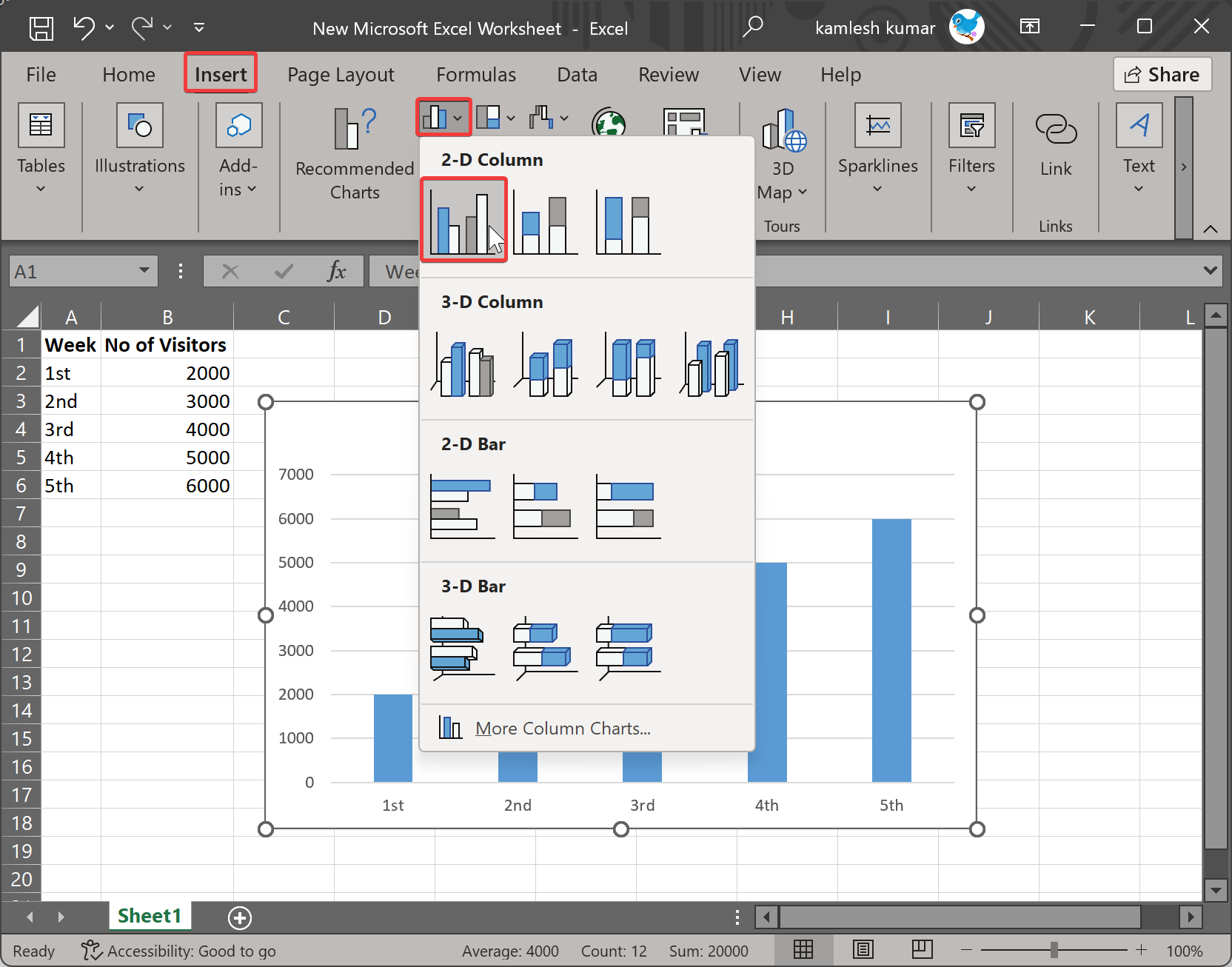
Step 3. Once you have a chart in Excel, click on it to select it. Now, click on the Chart Design tab in the menu bar to change the ribbon.
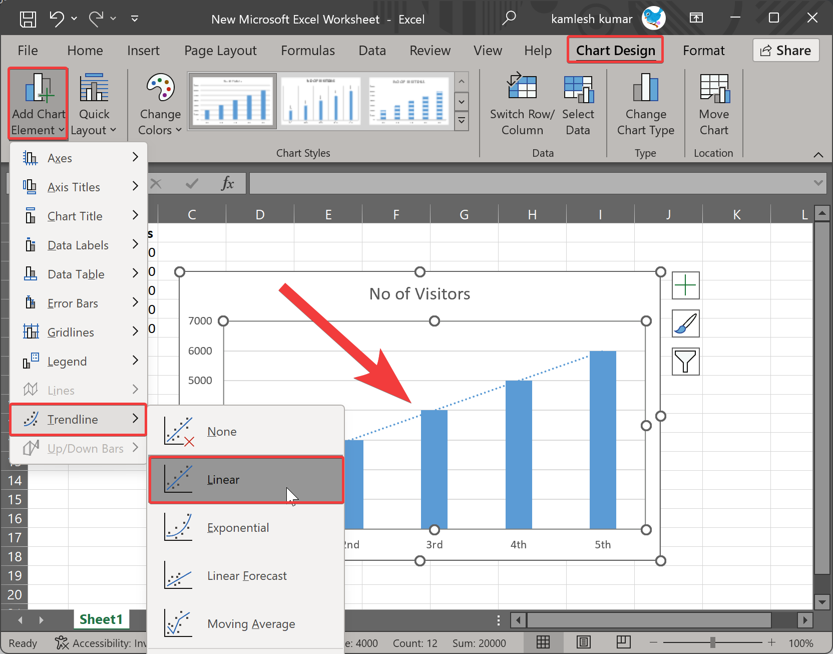
Step 4. Click Add Chart Element button under the Charts Layout group.
Step 5. Select the Trendline option in the drop-down menu and choose an option such as Linear to add to your graph.
The Linear Trendline will add a straight line to the chart that shows the increase or decrease over the period.
If you want to change the type of trendline, select the chart and click on the Chart Design tab. Now, click the Add Chart Element button under the Charts Layout group and choose the Trendline option in the drop-down menu. Finally, select a Trendline you want to add to your graph.
Through Right-click Menu
Right-click menus also provide quick access to the needed functionality in Excel. To add a Trendline on an Excel chart, use these steps:-
Step 1. Open your existing Excel Worksheet.
Step 2. Right-click on any candle in the chart and select the Add Trendline option in the menu.
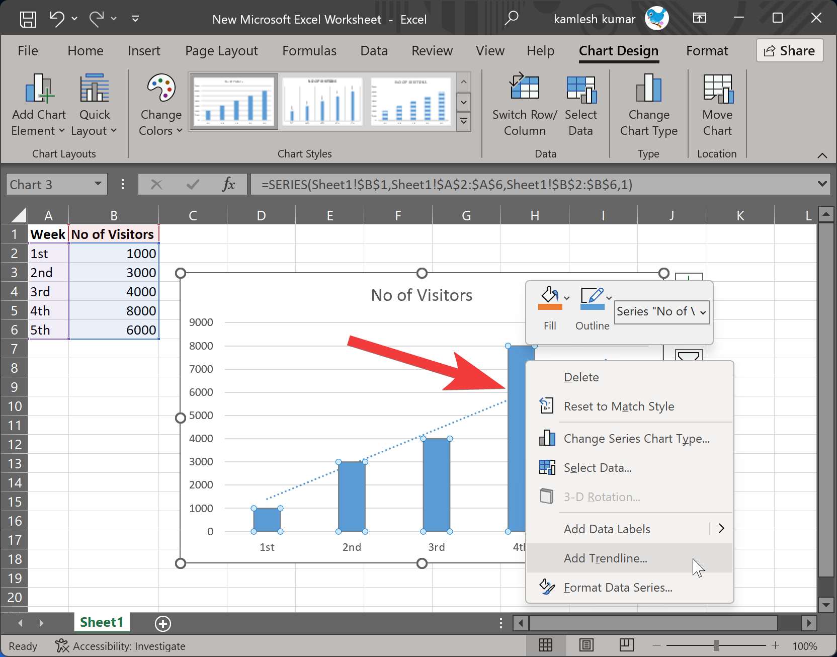
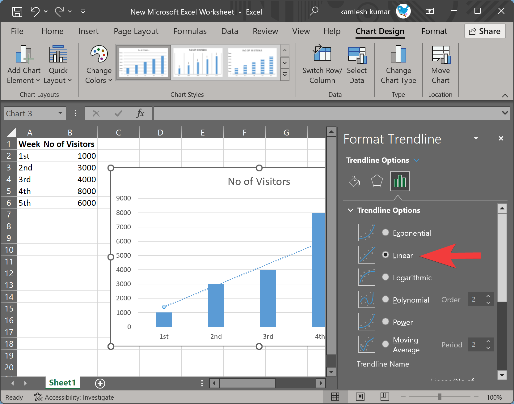
Step 3. When you’re done, the Format Trendline window will appear on the right side. Here, you’ll notice Linear option is selected automatically. However, you also choose another option if required.
How to Format Trendline in Excel?
Once you have a chart in Excel with Trendline and you want to format it, use these steps:-
Click on the chart, and some icons will appear on the right of it. These include chart elements, chart styles, and chart filters.
![]()
Chart Elements: This lets you show or hide Axes, Axis Titles, Chart Title, Data Labels, Data Table, Error Bars, Gridlines, Legend, Trendline. Using this option, you can even change the trendline type.
Chart Styles: This allows you to change the style of the chart as well as the color.
Chart Filters: This lets you filter categories in the chart.
Conclusion
In conclusion, adding a trendline to an Excel chart is a powerful tool that allows you to gain deeper insights into your data at a glance. By visualizing the general trend in your data, you can get averages, notice peaks and drops, and make better decisions or even predict what’s coming. With Microsoft Excel, it is easy to add a trendline to your chart using the Chart Design Group or right-click menu options. There are six different kinds of trendlines available, including exponential, linear, logarithmic, polynomial, power, and moving average. Once you have a chart with a trendline, you can format it by using the chart elements, chart styles, and chart filter options. Overall, trendlines are a great tool for investors, sales professionals, traders, and other professionals looking to make data-driven decisions.