Charts are useful for visually demonstrating information. Pie charts are particularly useful for illustrating portions of a larger picture.
In most cases, people think of charts in Excel and Word. In contrast, fewer people think of PowerPoint, the widely used and versatile presentation platform for presentations. Charts offer a simple yet effective way of presenting a wide range of data.
It is possible to add many types of charts to PowerPoint slides, including pie charts, line charts, and area charts, among others. This way, users can present their content in the most effective and organized way possible.
In this gearupwindows article, we will guide you on creating and customizing the Pie Chart in Microsoft PowerPoint.
How to Make a Pie Chart in Microsoft Powerpoint?
Follow these steps to create a pie chart in Powerpoint:-
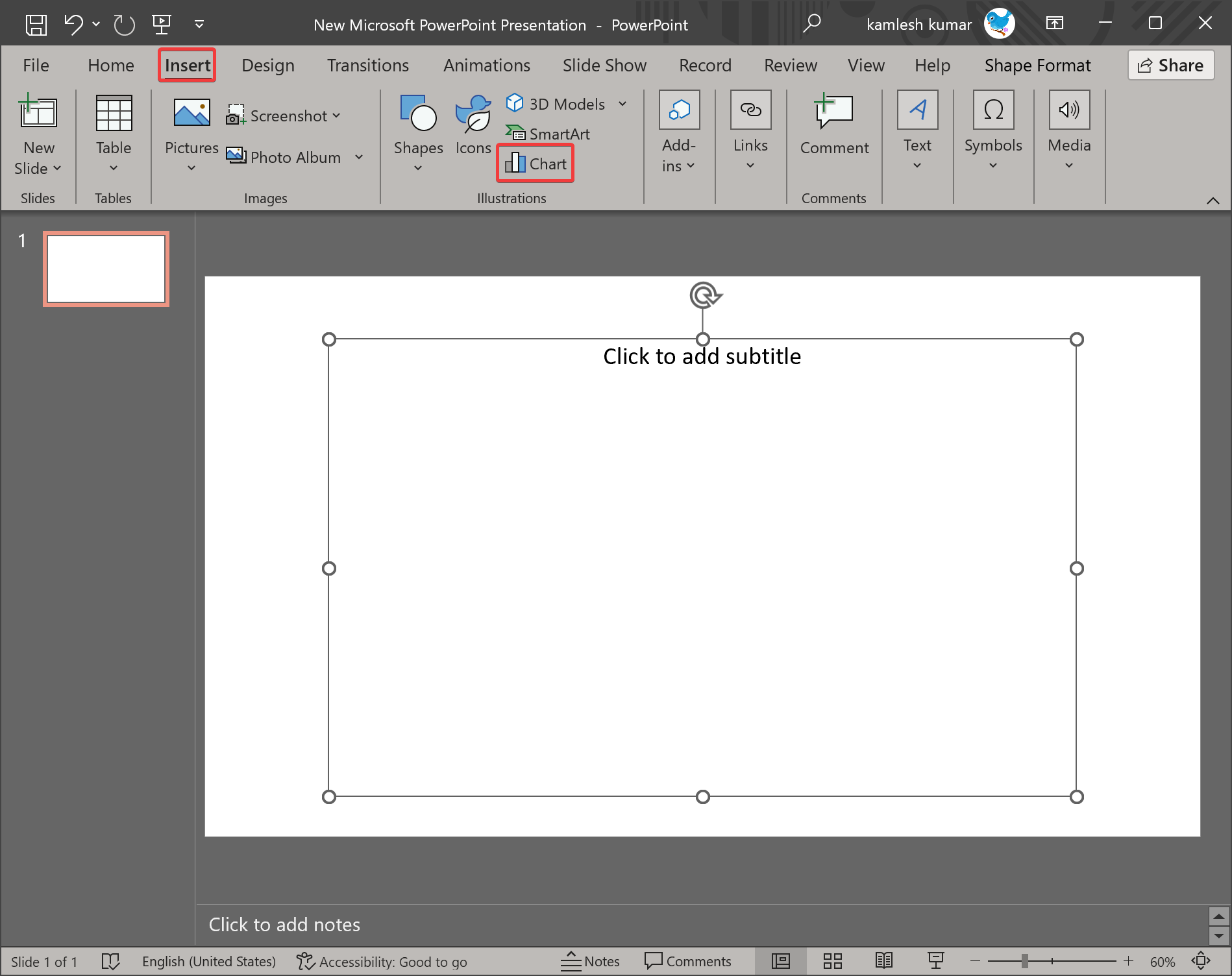
Step 1. To add a pie chart to a PowerPoint presentation, navigate to the place where it should appear.
Step 2. Then, click on the Insert menu and then the Chart button under the Illustrations group.
Step 3. When you’re done, the Insert Chart dialog box will open. Under All Charts, click on Pie on the left sidebar. Now, you will see 5 types of pie charts. These include:-
- Pie
- 3-D Pie
- Pie of Pie
- Bar of Pie
- Doughnut
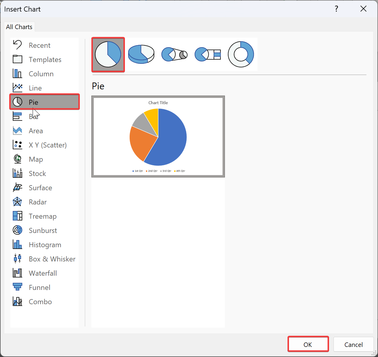
Step 4. Select a Pie chart you want to use. For example, we’ve chosen the first “Pie” chart.
Step 5. Next, click on the OK button.
Step 6. Upon completion, the Pie chart and its Excel data chart appear on the slide.
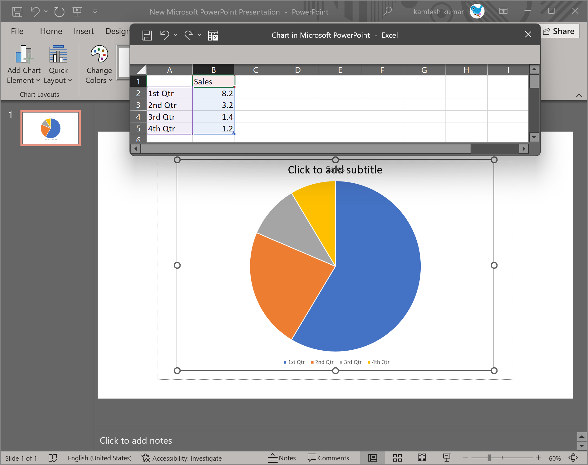
Quick Note: Click on the chart and select Chart Design > Edit Data > Edit Data if you don’t see the worksheet window.
How to Edit the Pie Chart Data?
After creating a basic Pie chart, you will need to edit its values according to your requirements. For editing the pie chart data in the worksheet window, follow these steps:-
Step 1. Make the worksheet window active by selecting it.
Step 2. To display the desired data in a Pie chart, modify rows and columns in the Excel spreadsheet.
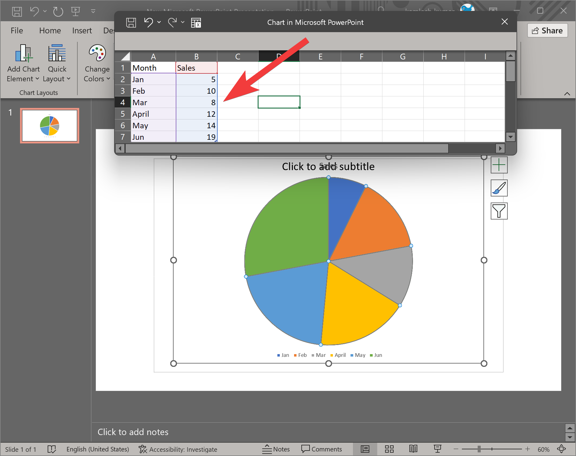
Step 3. In the top right corner, click the X icon to close the spreadsheet once you have entered the correct data.
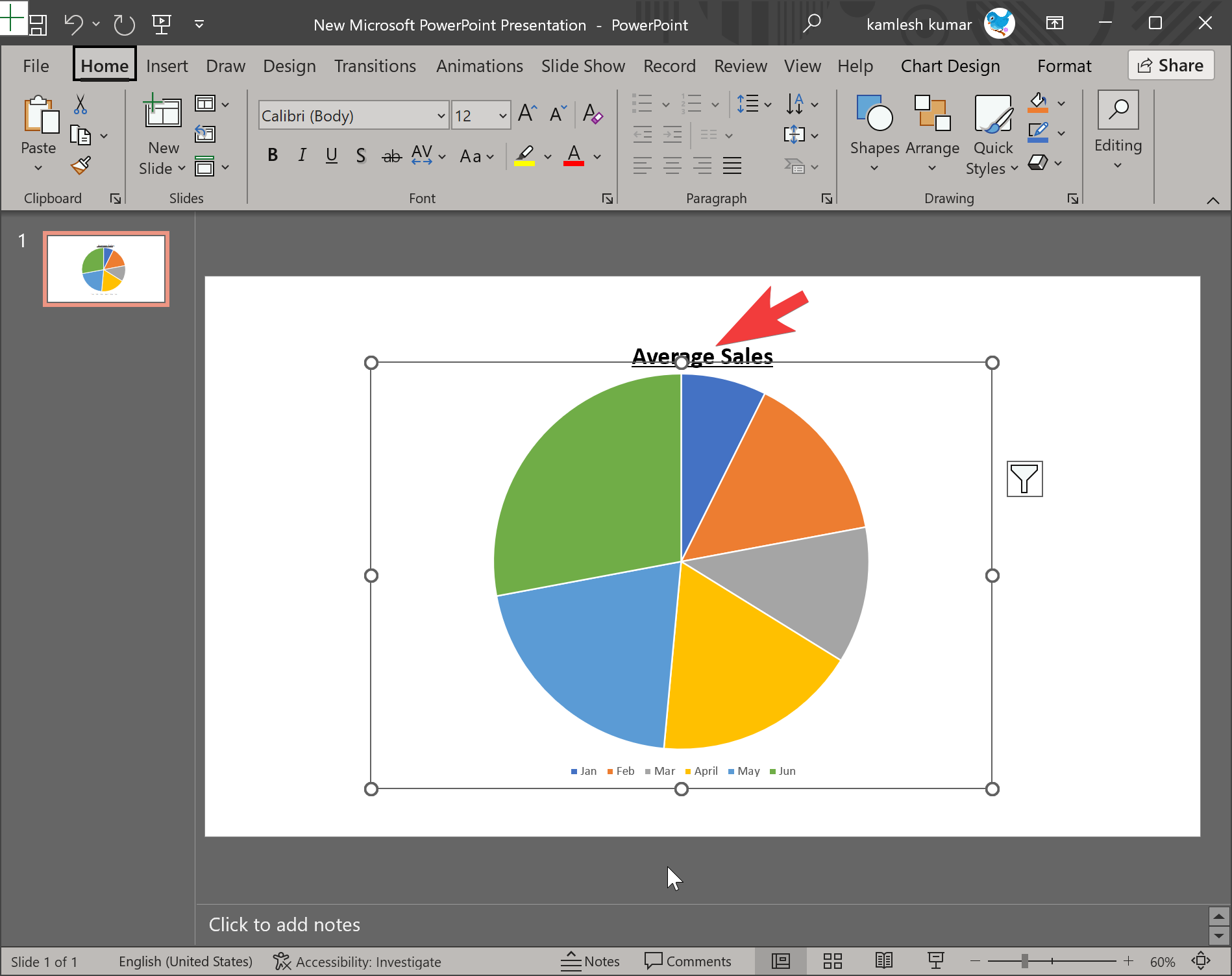
Step 4. Now, you can add a title to your pie chart by clicking on the Click to add title text box.
Step 5. If you want further editing to your Pie chart, click on it. On the right side of your Pie chart, three icons will appear. These include:-
- Chart Elements
- Chart Styles
- Chart Filters
Chart Elements: Clicking on Chart Elements, you can show or hide, the chart title, data labels, and legend. You can even align the legend to left, right, top or bottom.
Chart Styles: Using this option, you can choose different types of styles and color combinations for your Pie chart.
Chart Filters: This you can use to filter the data on your chart.
How to Add Animation to a Pie Chart?
Once you are ready with your Pie Chart in PowerPoint, you might want to add animation to charts that can make that visualization even better, allowing you to introduce one piece of a pie chart at a time, so there is more room for discussion. You can achieve this with Microsoft PowerPoint by following these steps:-
Step 1. To add an animation effect to your PowerPoint presentation, click on the Pie Chart you want to include animation.
Step 2. Next, select the Animations tab on the menu bar.
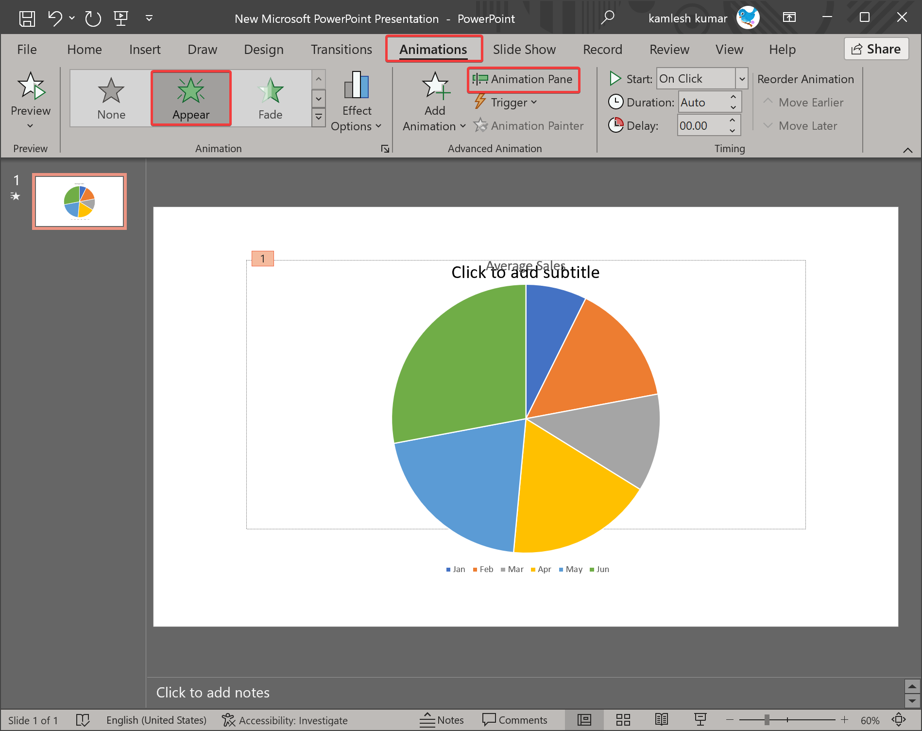
Step 3. Choose your favorite animation from the available choices. In this example, we’ll use “Appear.”
Step 4. Next, click theAnimation Pane under “Advanced Animation” section. The Animation Pane appears to the right of your slide.
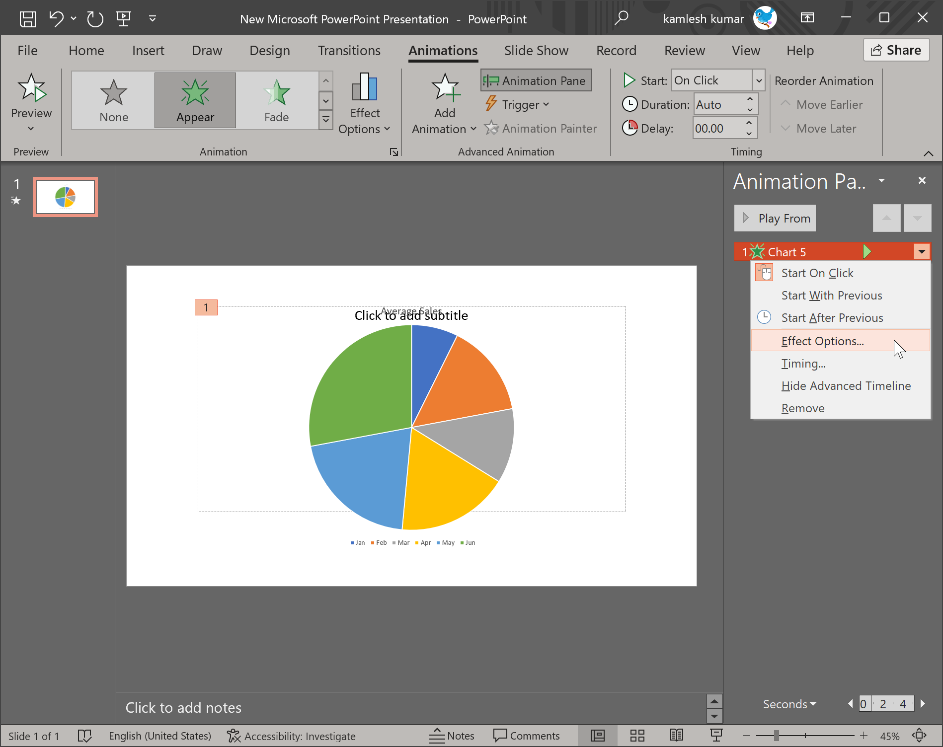
Step 5. Select Effect Options by clicking the arrow next to the animation you added to your pie chart.
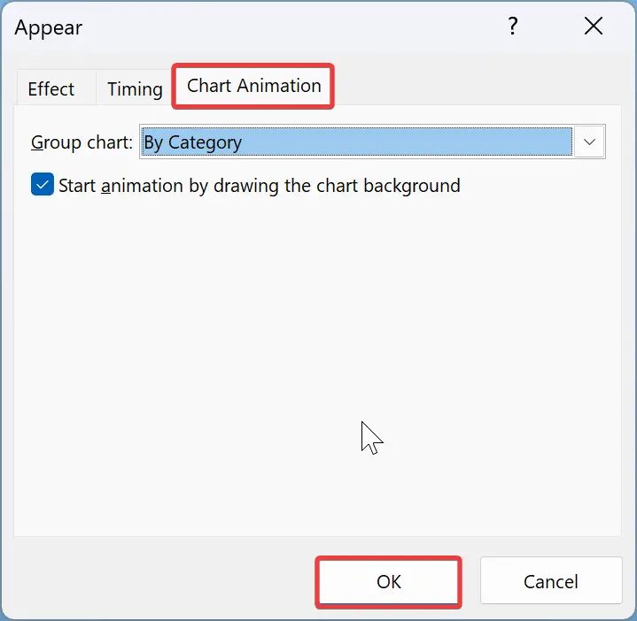
Step 6. When you’re done, a window will appear with Effect, Timing, and Chart Animation tabs. Switch to the Chart Animation tab. Here, you can select whether to display the chart animation “As One Object” or “By Category.” Selecting “As One Object” produces the whole chart at once, while selecting “By Category” produces one slice at a time.
You can decide whether to start the animation by drawing the chart background if you select “Group chart” by “By Category.”
Your Pie chart will look the same in the editing view, but you can preview it by pressing Shift+F5 to play your slide and then clicking your left mouse button to see it in action.
Conclusion
In conclusion, charts are an effective way of visually presenting information, and pie charts are particularly useful for demonstrating portions of a larger picture. Microsoft PowerPoint provides an easy-to-use platform for creating and customizing charts, including pie charts. By following the simple steps outlined in this article, users can quickly create and edit a pie chart in PowerPoint and even add animation effects to make their presentation even more engaging. Overall, pie charts are an essential tool for any presentation that aims to convey complex data in an easily digestible format.