Data tables are a valuable feature in Microsoft Excel that can enhance the clarity and comprehensibility of your charts and graphs. When you create a chart in Excel, you can opt to include a data table directly beneath it. This table displays the same data that’s represented graphically in the chart, making it easier for viewers to interpret and analyze the information. In this article, we’ll walk you through the process of using a data table in a Microsoft Excel chart.
What is a Data Table in Excel?
A data table in Excel is essentially a grid that displays the underlying data points of a chart or graph in a structured format. It mirrors the content of your chart, providing a textual representation of the data used to generate the visual representation. Data tables can be especially useful for comparing individual data points or for presenting precise numerical information that complements the chart.
Creating a Chart in Excel
Before we delve into adding a data table to an Excel chart, you first need to create a chart. Here’s how to do it:-
Step 1. Enter Data: Input the data you want to visualize into an Excel worksheet. Organize your data in columns or rows and ensure that it’s properly formatted.
In this example, we have a table with two columns: “Month” and “Sales.”
Step 2. Select Data: Highlight the data you wish to include in your chart. Make sure to select the relevant data cells.
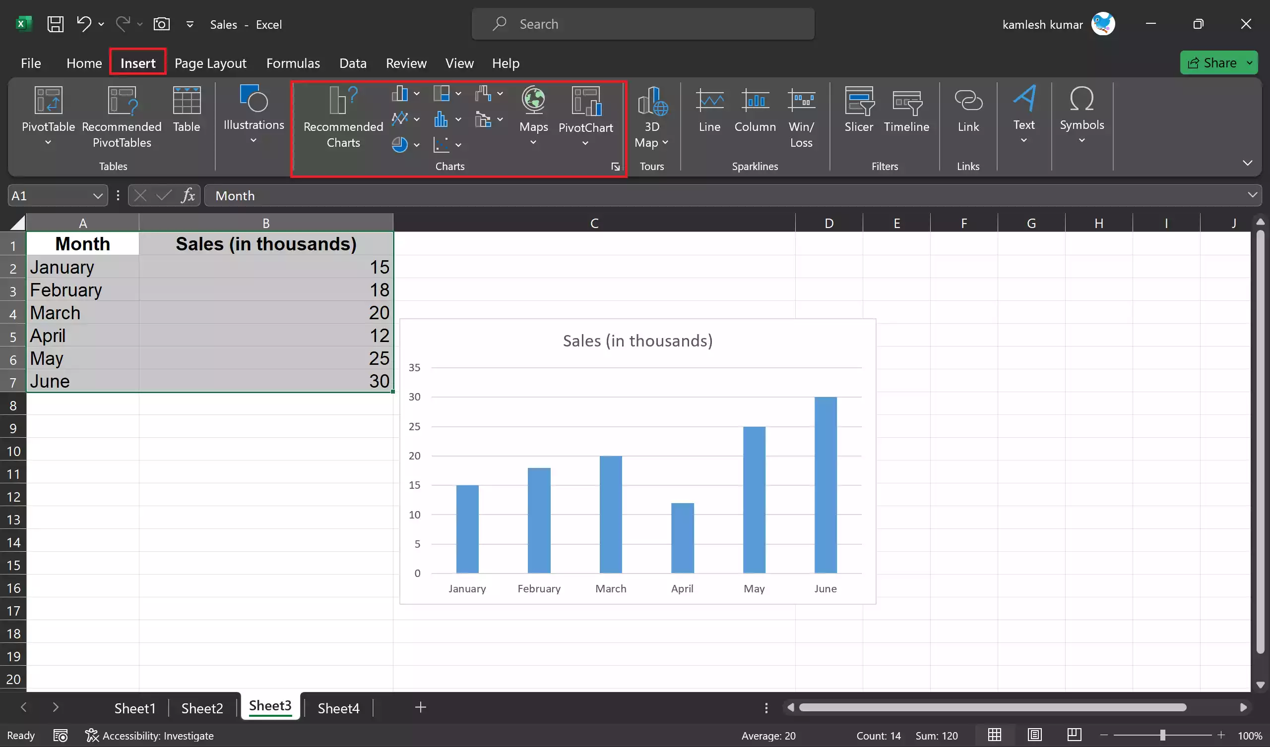
Step 3. Insert Chart: Go to the “Insert” tab on the Excel ribbon. In the Charts group, you’ll find various chart types, such as column charts, line charts, pie charts, and more. Choose the chart type that best suits your data and click on it.
Step 4. Customize Chart: After inserting the chart, you can customize it by adding labels, titles, and other elements to enhance its readability.
Adding a Data Table to Your Excel Chart
Once you have your chart, adding a data table is a straightforward process:-
Step 1. Click on the Chart: Select the chart you want to work with by clicking on it.
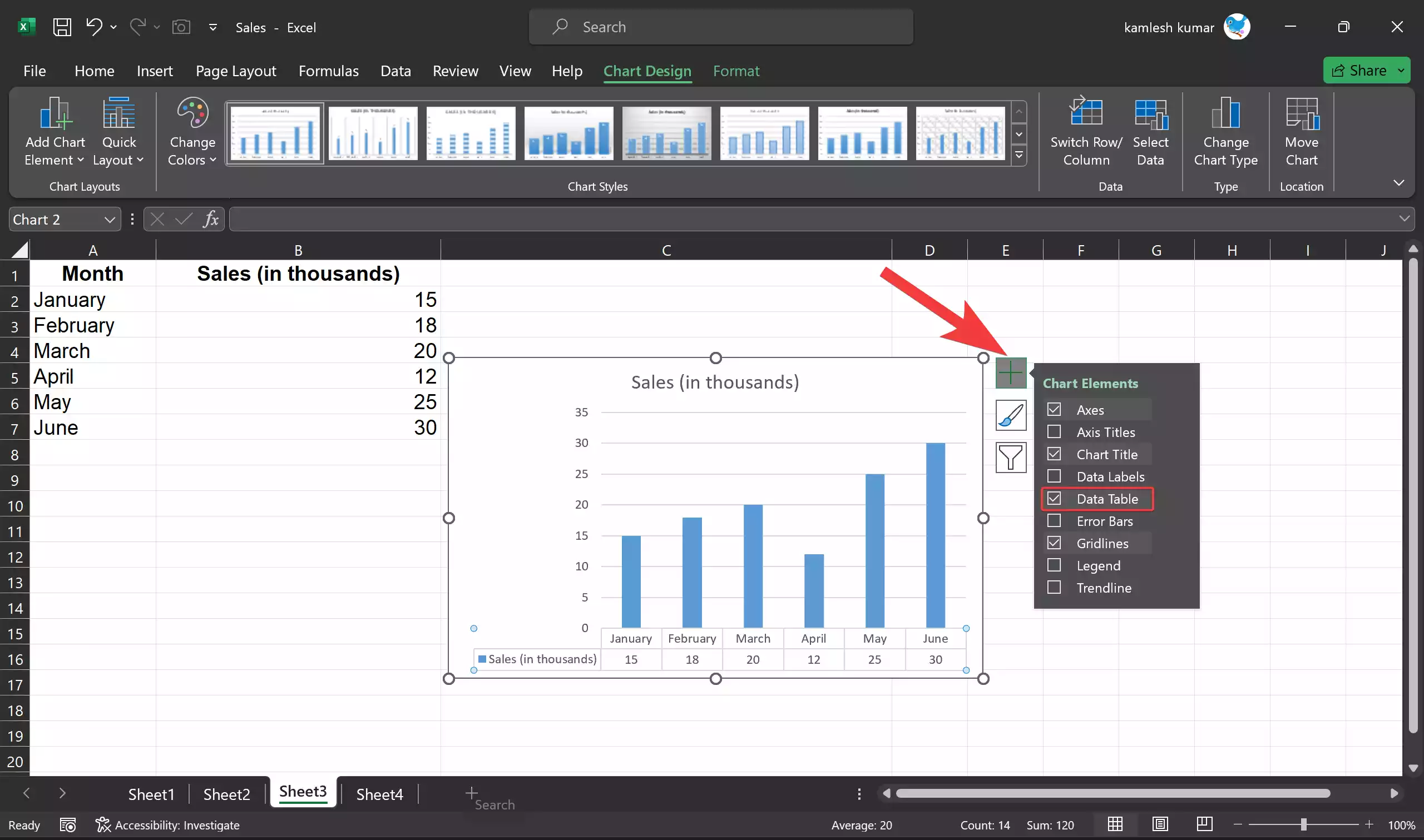
Step 2. Go to the “Chart Elements” Button: You’ll notice a small “+” icon at the top right corner of the chart. Click on it to open the “Chart Elements” menu.

Step 3. Check “Data Table”: In the “Chart Elements” menu, you will see a list of potential chart elements you can add to your chart. Check the “Data Table” option.
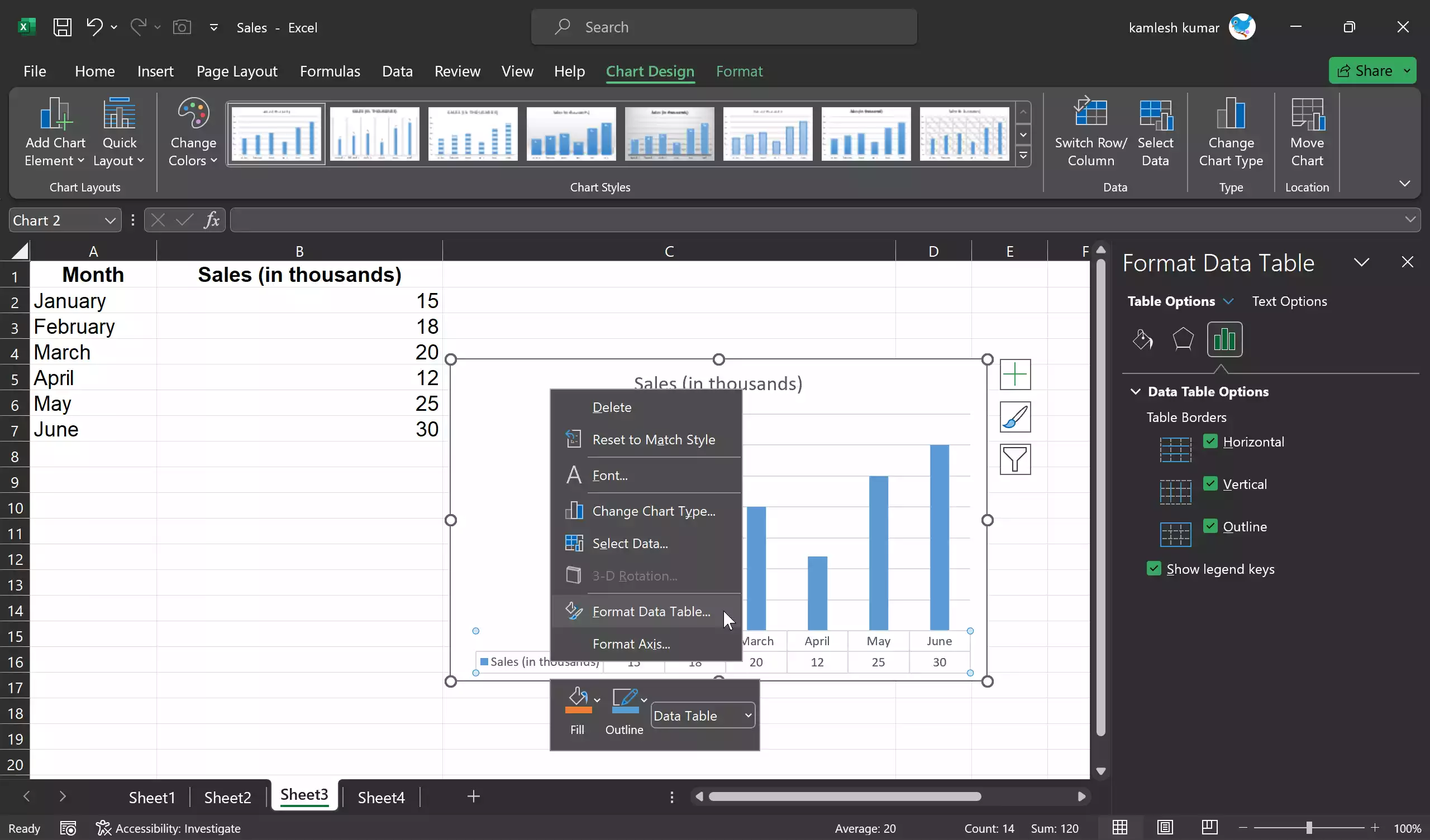
Step 4. Customize Data Table: By default, the data table will display the same data that’s represented in your chart. However, you can further customize the data table by right-clicking on it and selecting “Format Data Table.” This allows you to format the table, change its font, background color, and more.
Step 5. Adjust Data Table Position: You can move the data table to a different location within the chart area. Click on it and drag it to the desired position.
Step 6. Resize Data Table: To make the data table more legible, you can adjust its size by clicking and dragging its edges.
Benefits of Using a Data Table in Excel Charts
Including a data table in your Excel chart offers several advantages:-
Enhanced Clarity: Data tables provide a straightforward, numerical representation of the data, making it easier for viewers to understand and interpret the chart’s contents.
Precision: For charts that require exact numerical values, such as scientific or financial data, a data table ensures that the information is readily available.
Accessibility: Data tables can be especially beneficial for individuals with visual impairments who may rely on screen readers to interpret the data.
Data Verification: A data table allows you to double-check that the chart accurately reflects the underlying data.
Data Labeling: Data tables can serve as a secondary form of labeling for your chart, helping viewers understand what each data point represents.
Common Use Cases
Data tables are versatile and can be applied to various chart types and scenarios. Here are some common use cases:-
Financial Reports: When creating financial charts, a data table can display detailed figures like revenue, expenses, and profit.
Scientific Data: Scientific charts often benefit from data tables to display precise measurements or experimental results.
Market Analysis: For stock market analysis, data tables can show historical prices, trading volumes, and other financial data.
Engineering Diagrams: Engineers can use data tables to present critical parameters and values in technical charts and diagrams.
Survey Results: Survey data can be more comprehensible with a data table presenting response percentages and counts.
Performance Metrics: In business reports, data tables can display performance metrics such as key performance indicators (KPIs).
Conclusion
The inclusion of a data table in a Microsoft Excel chart is a powerful tool for enhancing data visualization and improving the comprehensibility of your charts. Whether you’re creating financial reports, scientific charts, or any other data-driven visual, data tables provide a straightforward, numerical representation of the data, making it easier for viewers to understand and analyze the information. By following the simple steps outlined in this article, you can take full advantage of this feature and ensure that your Excel charts are both informative and visually appealing.
