Microsoft Excel is a powerful tool for data analysis and visualization. One common task in data analysis is identifying values that are above or below the average of a set of numbers. Excel provides several built-in tools and functions that make this task easy, allowing you to highlight these values for better visualization and analysis. In this gearupwindows article, we will explore various methods to highlight values above or below the average in Excel.
How to Highlight Values Above or Below Average in Excel?
To highlight values above or below average in Microsoft Excel, follow these steps:-
Method 1: Using Conditional Formatting
Conditional Formatting is a versatile feature in Excel that allows you to format cells based on specific conditions. To highlight values above or below the average using Conditional Formatting, follow these steps:-
Step 1. Select the range of cells that contains the data you want to analyze.
Step 2. Go to the “Home” tab on the Excel ribbon.
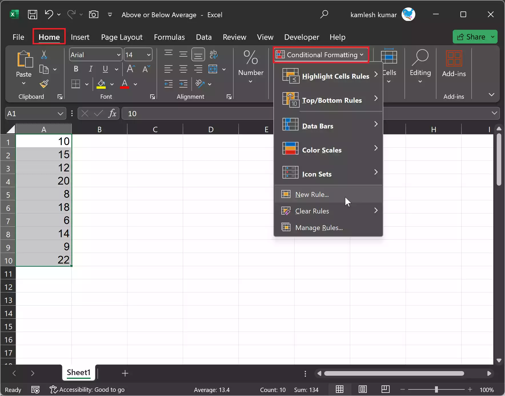
Step 3. Click on “Conditional Formatting” in the “Styles” group.
Step 4. Choose “New Rule” from the dropdown menu.
Step 5. In the “New Formatting Rule” dialog box, select “Use a formula to determine which cells to format.”
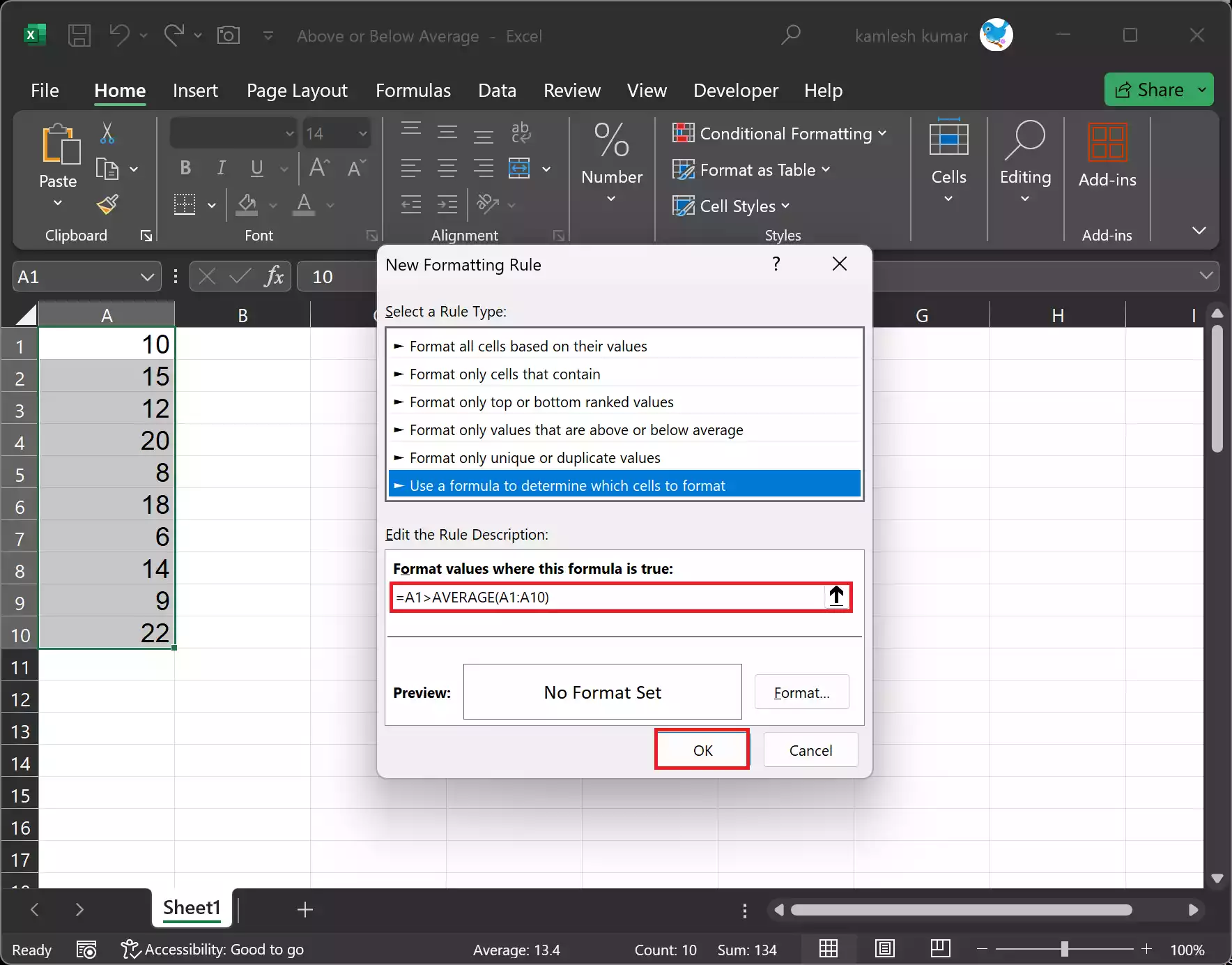
Step 6. In the “Format values where this formula is true” field, enter a formula to determine if a value is above or below the average. For example, to highlight values above the average, you can use the formula: =A1>AVERAGE(A1:A10). To highlight values below the average, use: =A1<AVERAGE(A1:A10).
Step 7. Click the “Format” button to define the formatting style for the highlighted cells. You can choose the font color, cell fill color, and other formatting options.
Step 8. Click “OK” to apply the formatting.
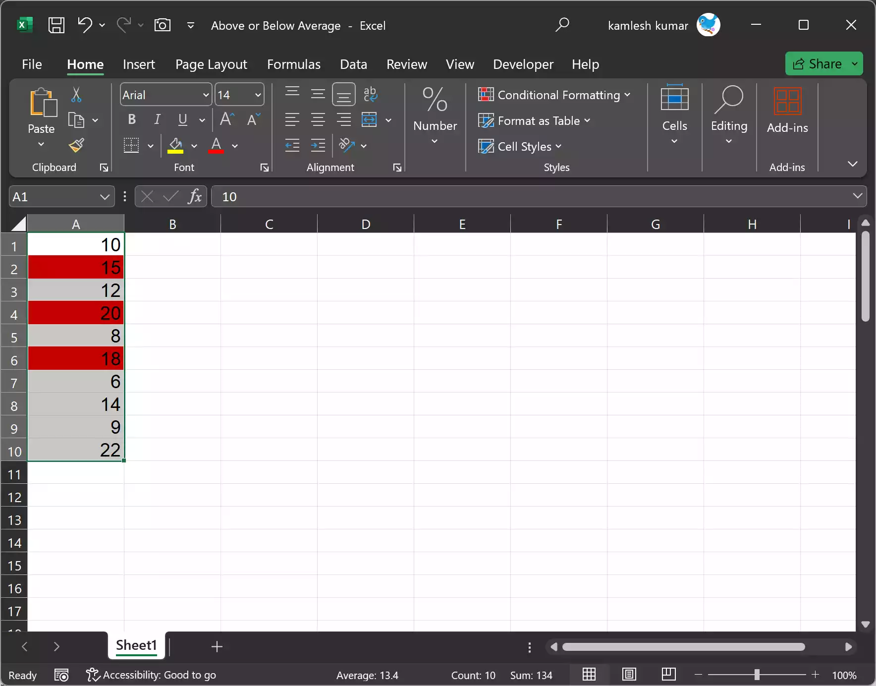
Now, the values that meet the condition you specified will be highlighted in your selected range.
Method 2: Using Data Bars
Data Bars are a type of Conditional Formatting that allows you to visualize the relative value of each cell within a selected range. This is particularly useful for quickly identifying values above or below the average. Here’s how to use Data Bars:-
Step 1. Select the range of cells you want to format.
Step 2. Go to the “Home” tab on the Excel ribbon.
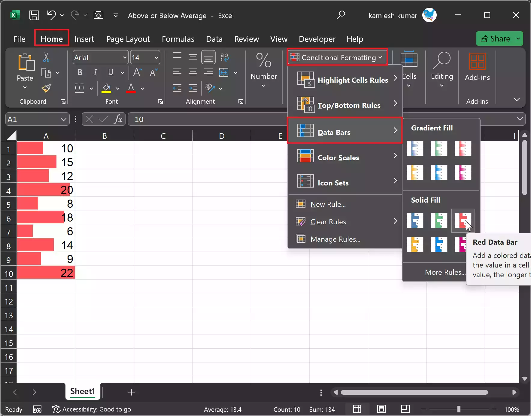
Step 3. Click on “Conditional Formatting” in the “Styles” group.
Step 4. Choose “Data Bars” and select one of the available data bar options.
Step 5. The data bars will be applied to the selected range, with longer bars representing higher values and shorter bars representing lower values relative to the other cells in the range.
Method 3: Using Color Scales
Color Scales are another type of Conditional Formatting that allows you to apply color gradients to cells based on their values. This method helps you visually identify values that are above or below the average. Here’s how to use Color Scales:-
Step 1. Select the range of cells you want to format.
Step 2. Go to the “Home” tab on the Excel ribbon.
Step 3. Click on “Conditional Formatting” in the “Styles” group.
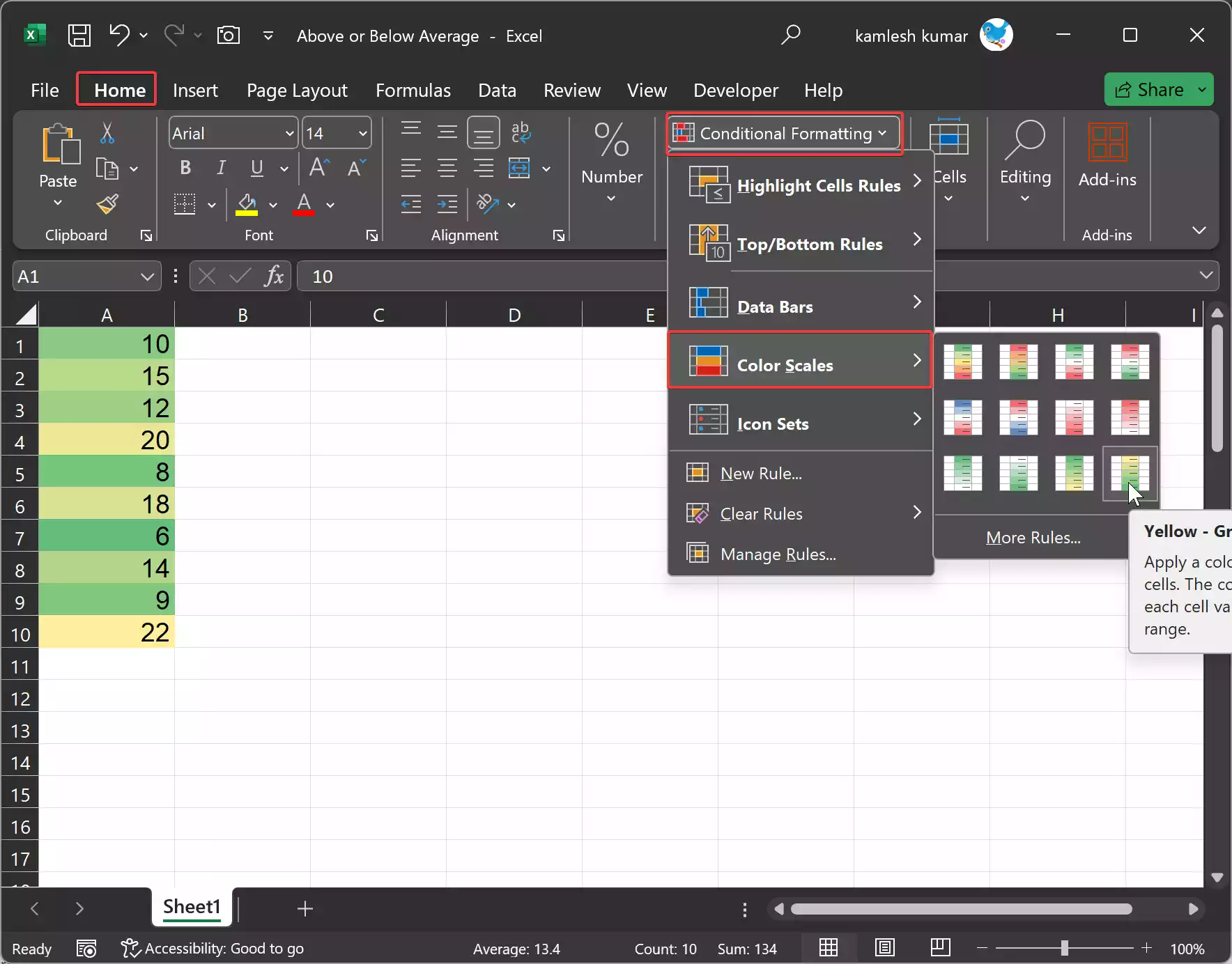
Step 4. Choose “Color Scales” and select one of the available color scale options.
Step 5. The selected color scale will be applied to the range, with colors indicating the relative values of the cells.
Method 4: Using Icon Sets
Icon Sets are a type of Conditional Formatting that allows you to use icons or symbols to represent values in a range. This method is useful for highlighting values above or below the average with specific icons. Here’s how to use Icon Sets:-
Step 1. Select the range of cells you want to format.
Step 2. Go to the “Home” tab on the Excel ribbon.
Step 3. Click on “Conditional Formatting” in the “Styles” group.
![]()
Step 4. Choose “Icon Sets” and select one of the available icon set options.
Step 5. The selected icon set will be applied to the range, and icons will appear in each cell based on their values.
Choose the icon set that best suits your needs and helps you identify values above or below the average more easily.
Method 5: Using Formulas and Helper Cells
If you prefer a more customized approach, you can use Excel’s formulas and helper cells to highlight values above or below the average. This method provides greater flexibility but requires a bit more effort. Here’s how to do it:-
Step 1. Insert a new column adjacent to your data, or choose an empty column where you want to display the formatting.
Step 2. In the first cell of the new column, use a formula to calculate the average of the data, such as =AVERAGE(A1:A10), where A1:A10 is the range you want to analyze.
Step 3. Copy the result of the average to the entire column.
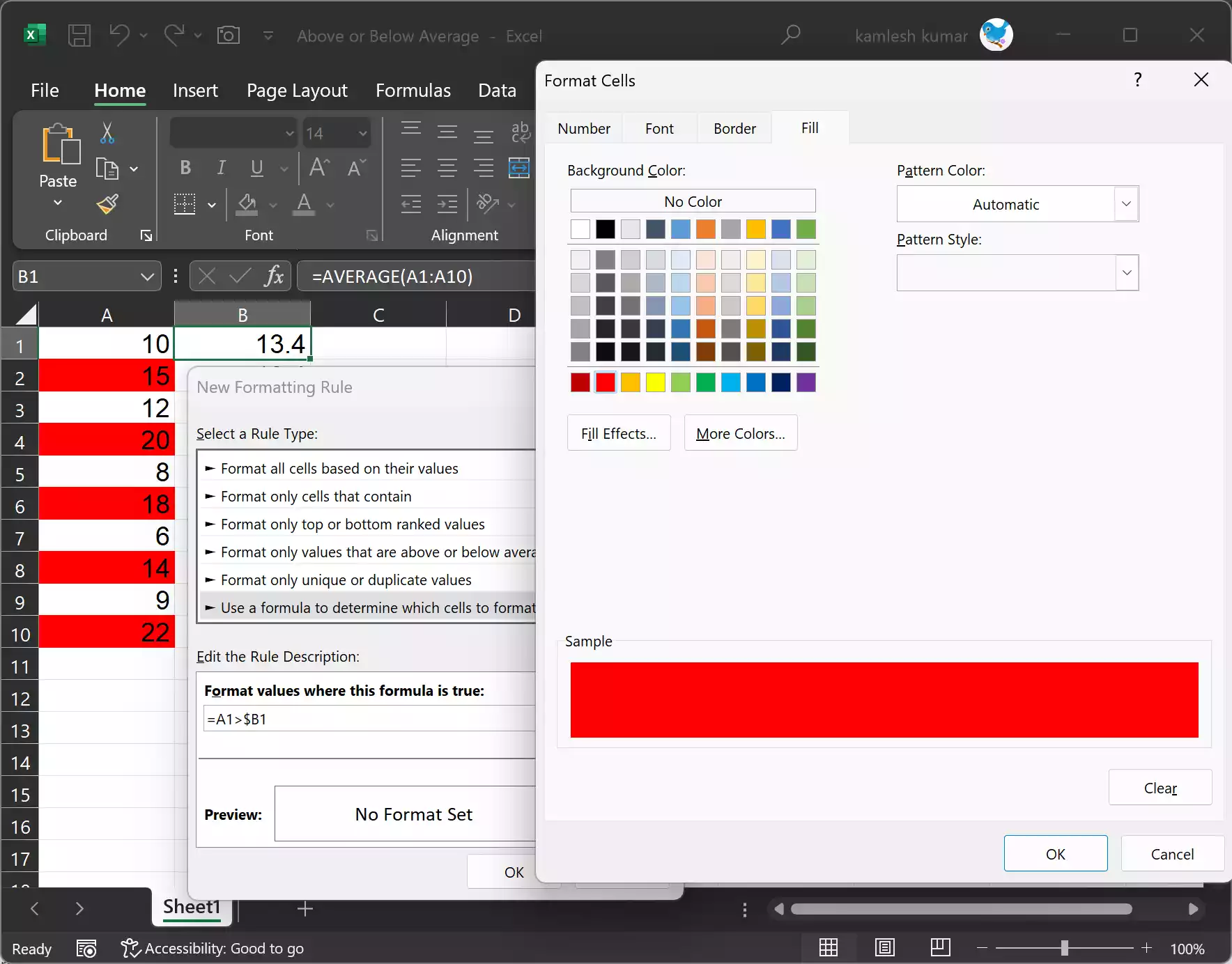
Step 4. In the column next to the one with the averages, use conditional formatting (as described in Method 1) to format cells based on the condition you want. For example, you can use a formula like =A1>$B1 to format values above the average, where A1 is the cell you want to format, and B1 is the cell containing the average.
By using this method, you have complete control over the conditions and formatting, allowing for a customized solution that meets your specific needs.
Conclusion
In conclusion, Excel offers various methods to highlight values above or below the average, depending on your preferences and the complexity of your data. Whether you choose to use Conditional Formatting, Data Bars, Color Scales, Icon Sets, or formulas with helper cells, these techniques will help you gain valuable insights from your data and make your Excel spreadsheets more visually informative and accessible.