Scatter plots, also known as scattergrams or scatter charts, are essential tools in data analysis and visualization. They allow you to explore and display the relationship between two sets of data points. Microsoft Excel, a widely used spreadsheet software, provides a user-friendly platform for creating scatter plots. In this gearupwindows article, we’ll walk you through the steps to make a scatter plot in Excel.
How to Make a Scatter Plot in Microsoft Excel?
To create Scatter Plot in Microsoft Excel, follow these steps:-
Step 1. Before you can create a scatter plot, you need to have your data organized properly. In Excel, each data point should have two corresponding values – one for the X-axis (horizontal) and another for the Y-axis (vertical). Ensure that your data is in a structured table or list format.
Step 2. If you’re not already in Excel, open the program. You can do this by clicking on the Excel icon in your taskbar or Start menu. If you don’t have Excel, you can also use free alternatives like Google Sheets or OpenOffice Calc.
Step 3. Open a new or existing spreadsheet in Excel and input your data. For this example, let’s say you’re studying the relationship between the number of hours studied and exam scores. You can create a table like this:-

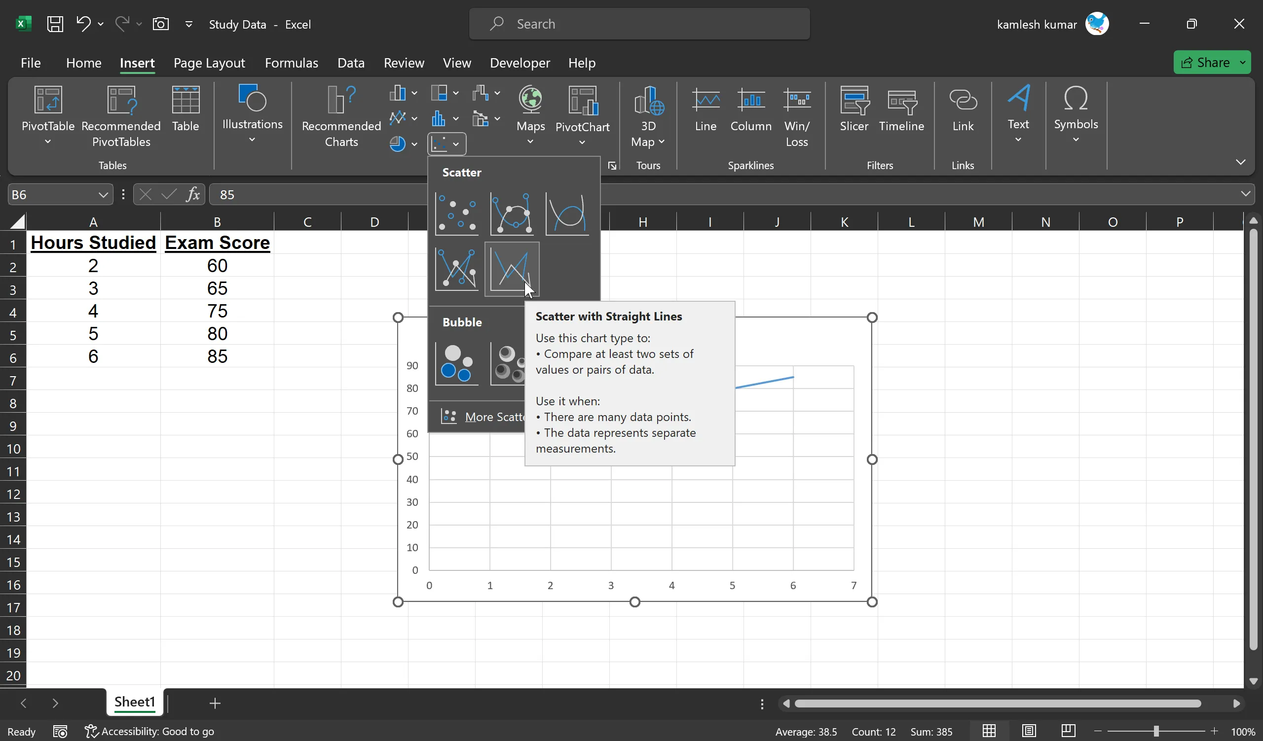
Step 4. Click and drag your mouse to select the data you want to include in your scatter plot. In our example, you should select both the “Hours Studied” and “Exam Score” columns.
Step 5. With your data selected, go to the “Insert” tab on the Excel ribbon. In the “Charts” group, select “Scatter.” You’ll see various scatter plot options, but for a basic scatter plot, choose the “Scatter with Straight Lines” option.
Step 6. Excel will insert a default scatter plot onto your worksheet. You can now customize it to fit your needs:-
Add Titles and Labels: Double-click the chart title and axis labels to edit them. In our example, you can label the X-axis as “Hours Studied” and the Y-axis as “Exam Score.” The chart title could be “Study Time vs. Exam Score.”

Format Data Points: You can customize the appearance of data points. Right-click on a data point on the chart, choose “Format Data Point,” and you can modify the shape, size, or color of the data points.
Add a Trendline: To understand the trend in your data, you can add a trendline. Select a chart and click on the + to the top right of the chart. Select Trendline. Now, choose the type of trendline that best fits your data, such as linear, exponential, or linear forecast.
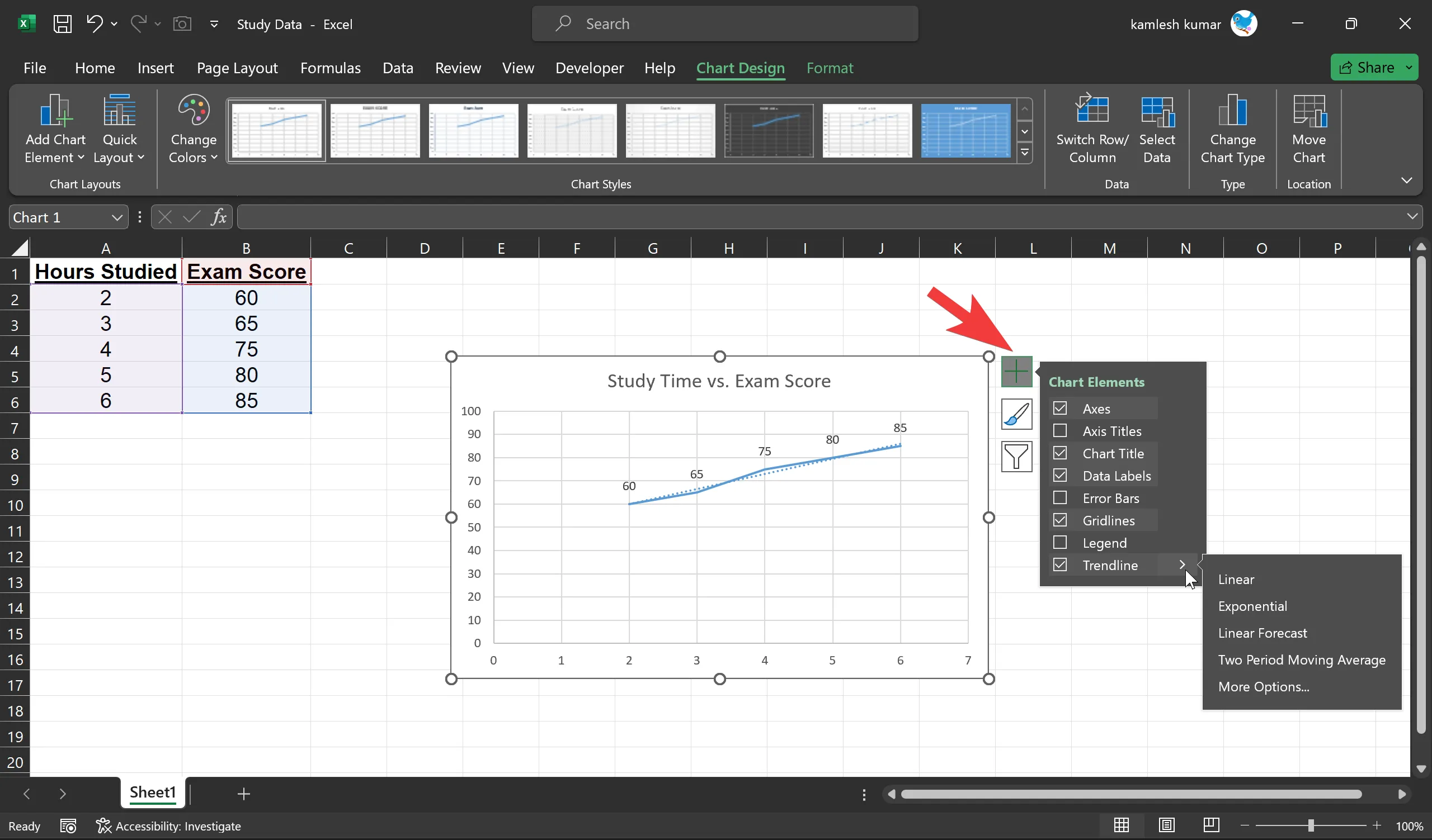
Modify the Chart Area: You can adjust the size of your chart, add gridlines, and make other formatting changes. Simply click on the chart area and use the “Chart Design” on the Excel ribbon.
Step 7. After customizing your scatter plot, it’s a good practice to save your work. This way, you can easily retrieve the chart and associated data for future reference. To save your Excel file, go to “File” > “Save” or “Save As.”
Step 8. With your scatter plot in hand, you can now interpret the data and draw conclusions. In our example, you can see if there’s a correlation between the number of hours studied and exam scores. A positively sloped trendline would suggest that more study time leads to higher scores, while a negatively sloped line would indicate the opposite.
Remember that scatter plots are a visual tool for understanding data relationships. To make more precise inferences, you might want to perform statistical analysis on your data using tools like regression analysis.
Conclusion
In conclusion, creating a scatter plot in Microsoft Excel is a straightforward process. By following these steps and customizing your chart to suit your specific data, you can effectively visualize and analyze the relationships between different variables. Scatter plots are invaluable tools for researchers, analysts, and anyone looking to gain insights from their data.
