Data analysis is a cornerstone of decision-making in the modern world, and Excel remains one of the most powerful tools for this purpose. When it comes to understanding complex data sets and uncovering hidden insights, heatmaps can be your best friend. In this step-by-step guide, we will explore the art of creating heatmaps in Excel, from basic conditional formatting to customized color scales.
The Power of Heatmaps
Heatmaps are graphical representations of data in which values are depicted as colors. They provide a visual way to understand patterns, relationships, and variations within a dataset. Whether you’re dealing with financial data or sales figures, heatmaps offer a compelling way to present and analyze information.
How to Create a Heatmap in Excel?
Creating a Basic Heatmap with Conditional Formatting
Step 1. Begin by opening Excel and entering your data. For this illustration, imagine you want to analyze monthly expenses across different departments. Your table might look like this:-
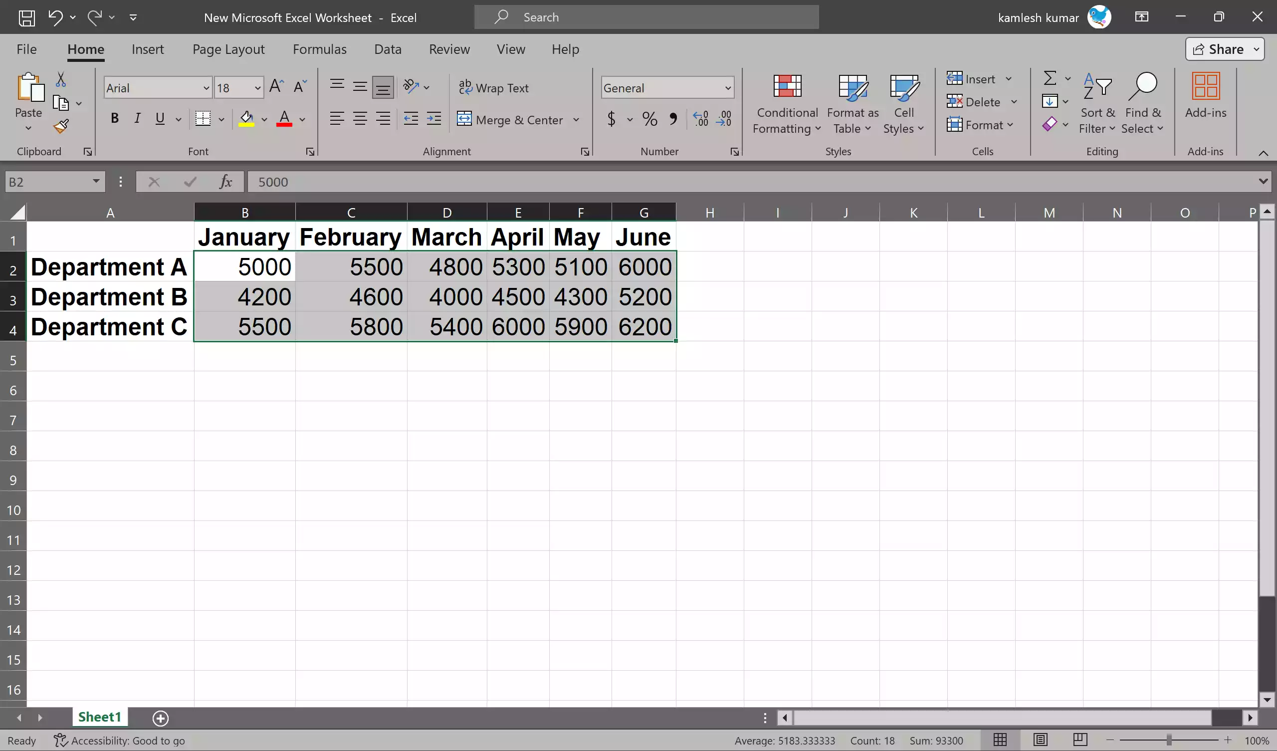
Step 2. Click and drag to select the numeric data you want to include in your heatmap.
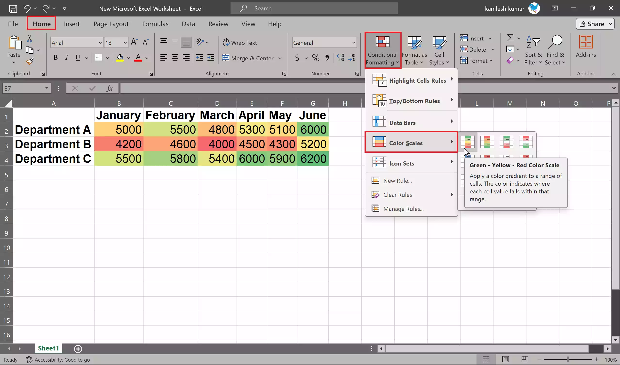
Step 3. Navigate to the “Home” tab and click on “Conditional Formatting” in the “Styles” group.
Step 4. From the dropdown, select “Color Scales.” A range of preset color gradients will appear. Choose one that suits your data. For instance, you might select the “Green – Yellow – Red Color Scale,” where green signifies lower expenses, red indicates higher expenses, and yellow represents values in between.
Voila! You’ve just created a basic heatmap that visually represents your data’s patterns and trends.
Customizing Your Heatmap with a Unique Color Scale
While Excel’s default color scales are handy, there are times when you want a more tailored approach, perhaps aligning the colors with your brand palette or emphasizing specific data points.
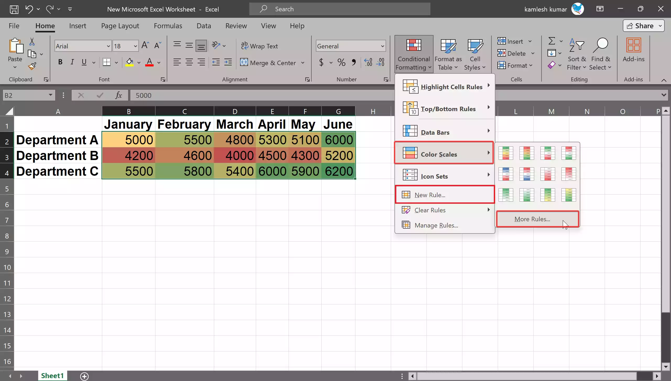
Step 1. Just like before, start by opening the “Conditional Formatting” menu in the “Styles” group.
Step 2. In the drop-down menu select “New Rule” or “Color Scales > More Rules.”
Step 3. In the “New Formatting Rule” dialog box, choose either a “2-Color Scale” or a “3-Color Scale” based on your preference.
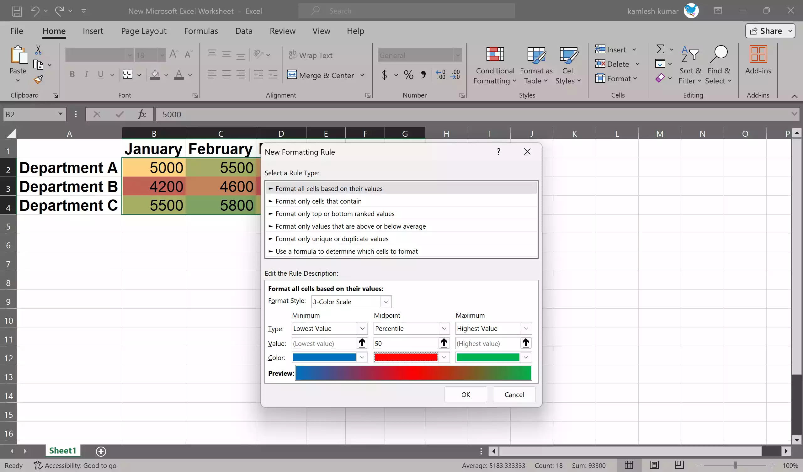
Step 4. Now comes the fun part. Customize the colors for the maximum, midpoint, and minimum values. For instance, you could use dark blue for the lowest values, red for the midpoint, and green for the highest. You can also specify the value for each color point.
Click “OK” to apply your custom color scale, and your heatmap will now tell a unique and compelling story.
Conclusion
In conclusion, mastering the art of creating heatmaps in Excel opens up a world of possibilities for data analysis and visualization. Whether you’re a finance professional, a marketing analyst, or a researcher, heatmaps can help you present your data in a compelling and informative manner. So, dive into Excel, harness the power of heatmaps, and unlock the hidden insights within your data.