Charts and graphs are essential tools in Excel that help users visualize data and make it easier to understand trends, patterns, and relationships. Whether you’re presenting sales data, analyzing financial information, or illustrating survey results, Excel provides a powerful suite of charting tools. In this step-by-step guide, we’ll walk you through the process of creating various types of charts and graphs in Excel.
How to Create Charts and Graphs in Excel?
To create Charts and Graphs in Excel, follow these steps:-
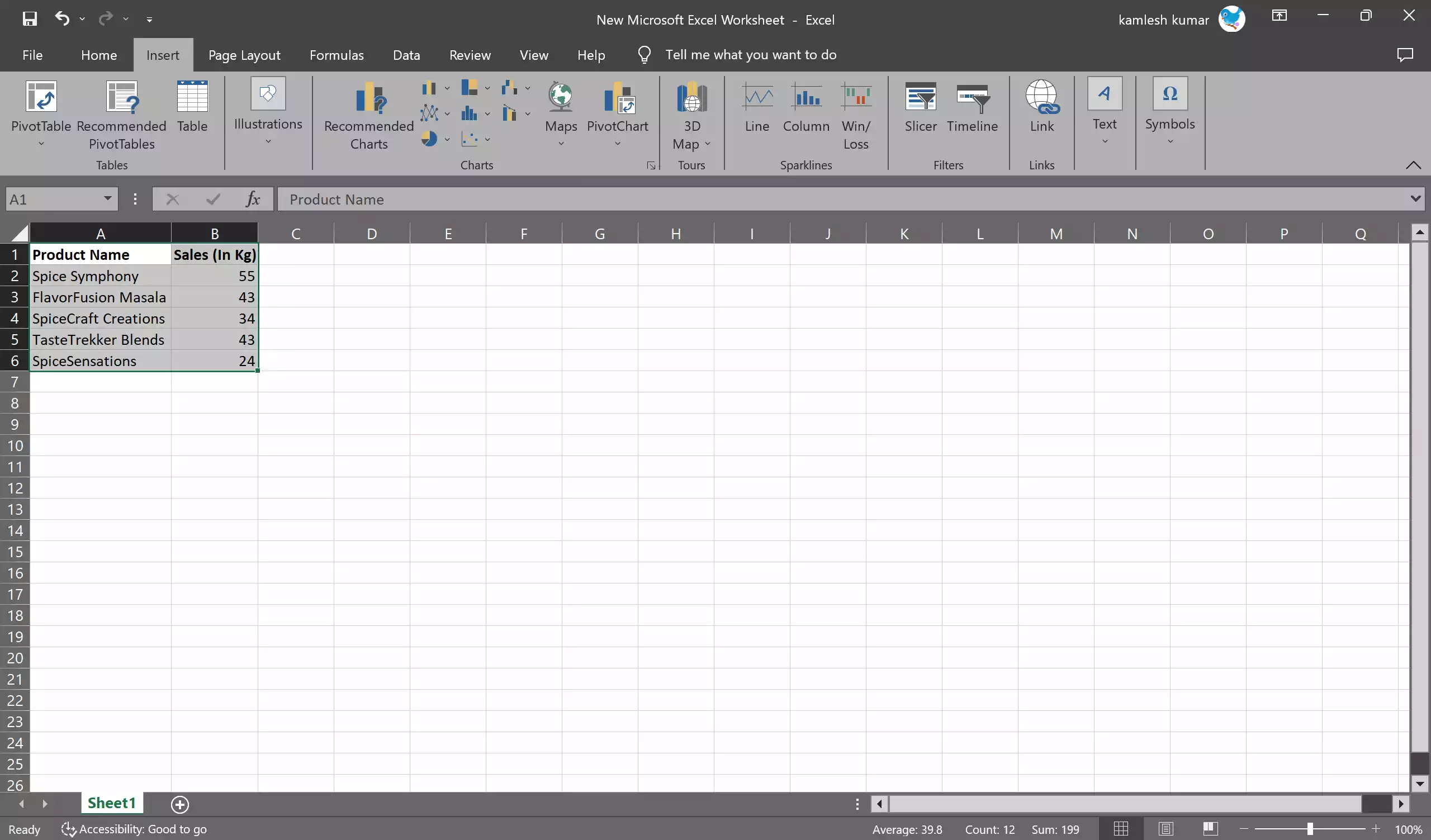
Step 1. Before you can create a chart or graph in Excel, you need to have your data organized. Follow these tips for data preparation:-
- Ensure your data is in a tabular format with clear headers.
- Select the data you want to include in the chart, including labels and values.
- Make sure your data is free from errors or missing values.
Step 2. Highlight the data you want to include in your chart. This can be a range of cells or a table with headers.
Step 3. With your data selected, go to the “Insert” tab in the Excel ribbon.
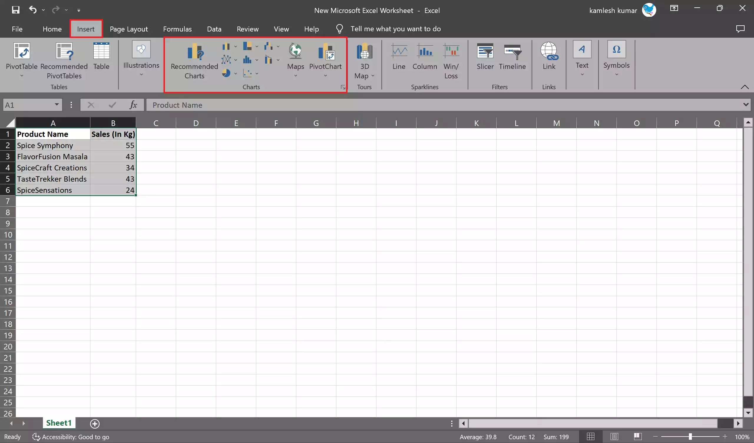
Step 4. Inside the “Charts” group, you’ll see a variety of chart types, such as bar charts, line charts, pie charts, and more. Select the chart type that best suits your data and the message you want to convey. For example, choose a bar chart for comparing data categories or a line chart for showing trends over time.
Step 5. Once you’ve inserted the chart, it will appear on your Excel sheet.
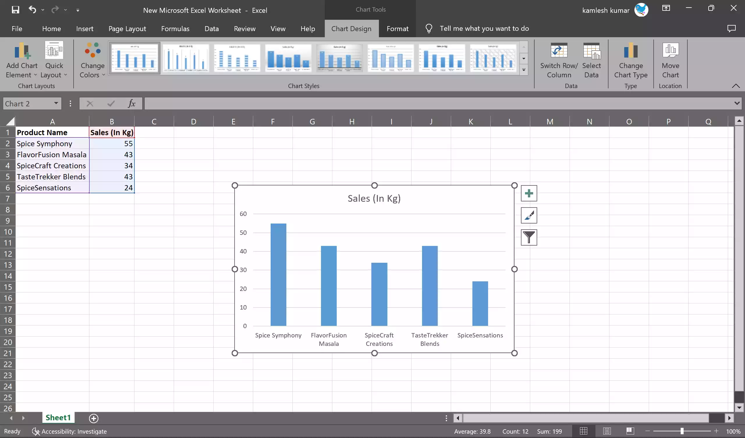
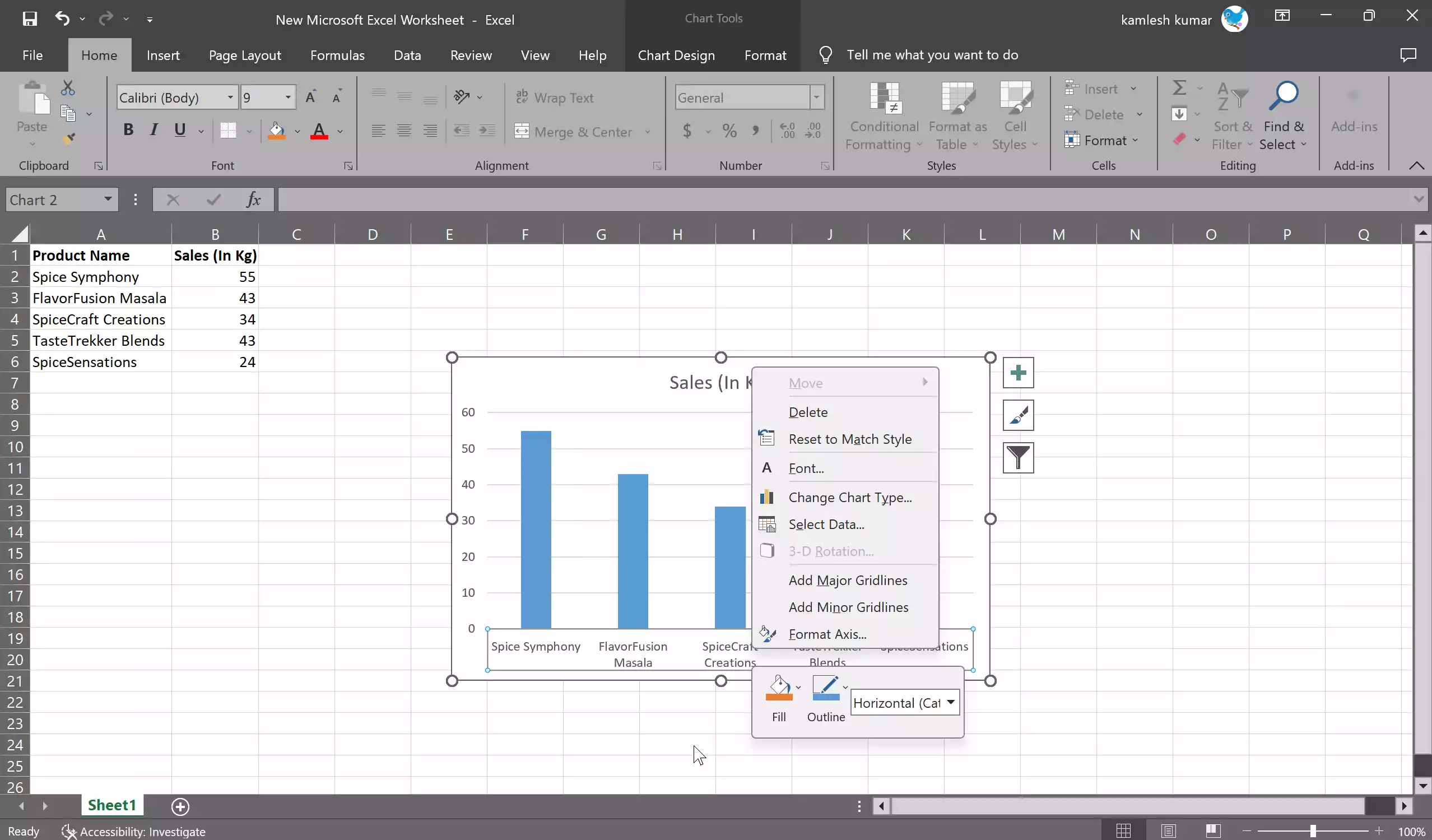
Step 6. You can now customize your chart by adding labels, titles, and adjusting the axis scales. Right-click on different chart elements (e.g., axes, data series) to format and modify them according to your preferences.
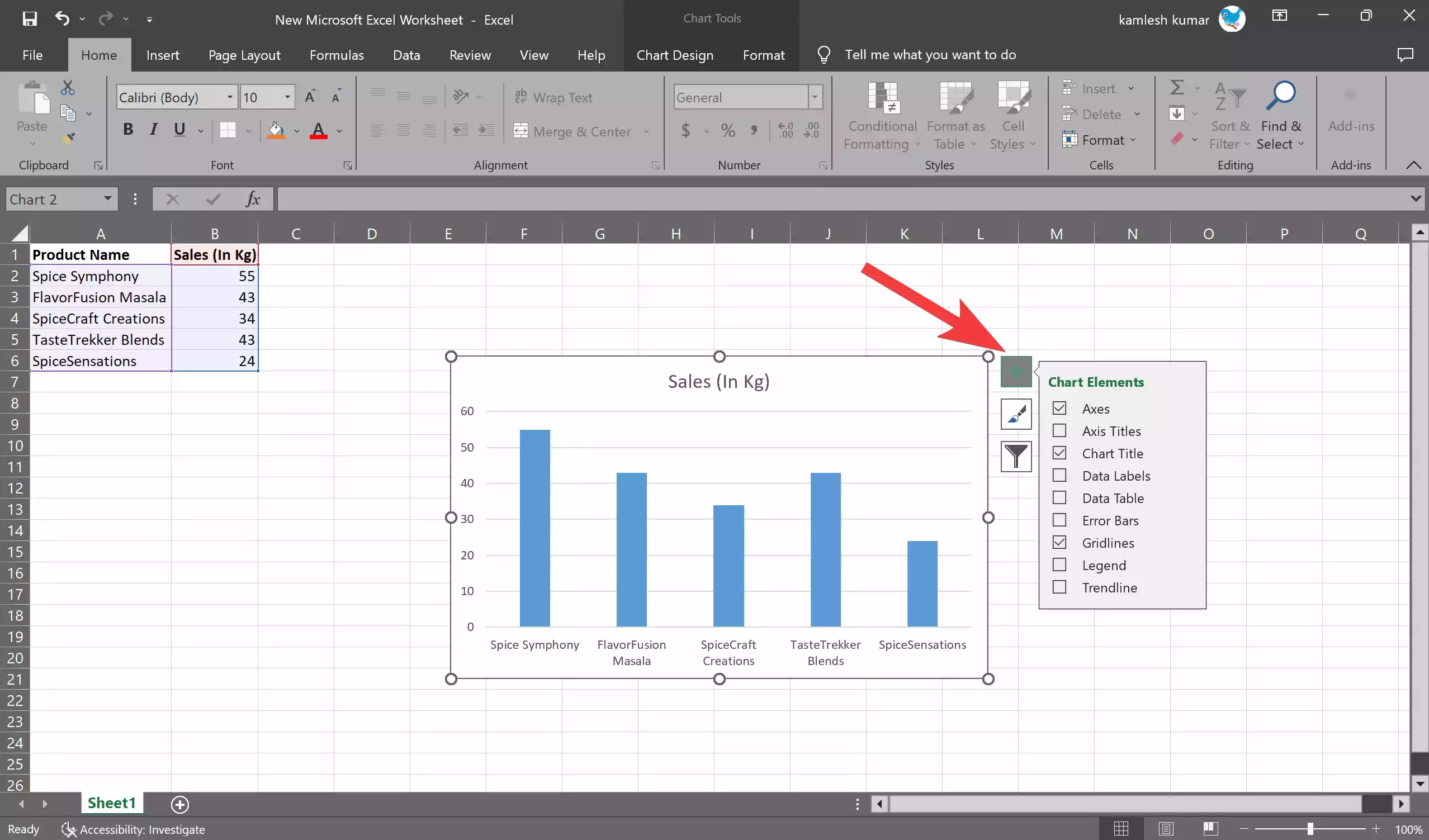
Step 7. To make your chart more informative, consider adding data labels and a legend. Click on the chart, and the “Chart Elements” button (represented by a plus icon) will appear. Use it to add or remove elements like data labels and legends.
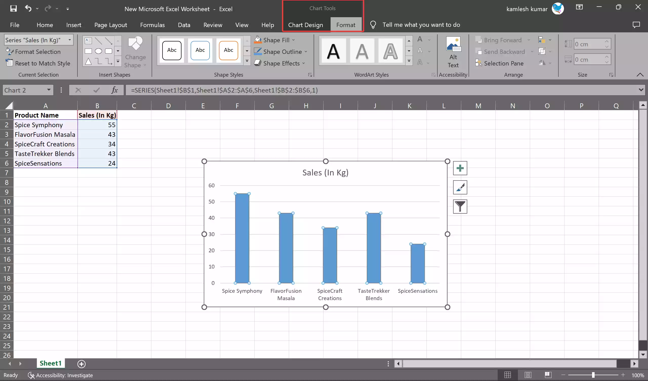
Step 8. Excel offers a range of formatting options to make your chart visually appealing. Right-click on chart elements or use the “Chart Tools” contextual ribbon to format fonts, colors, and other chart properties.
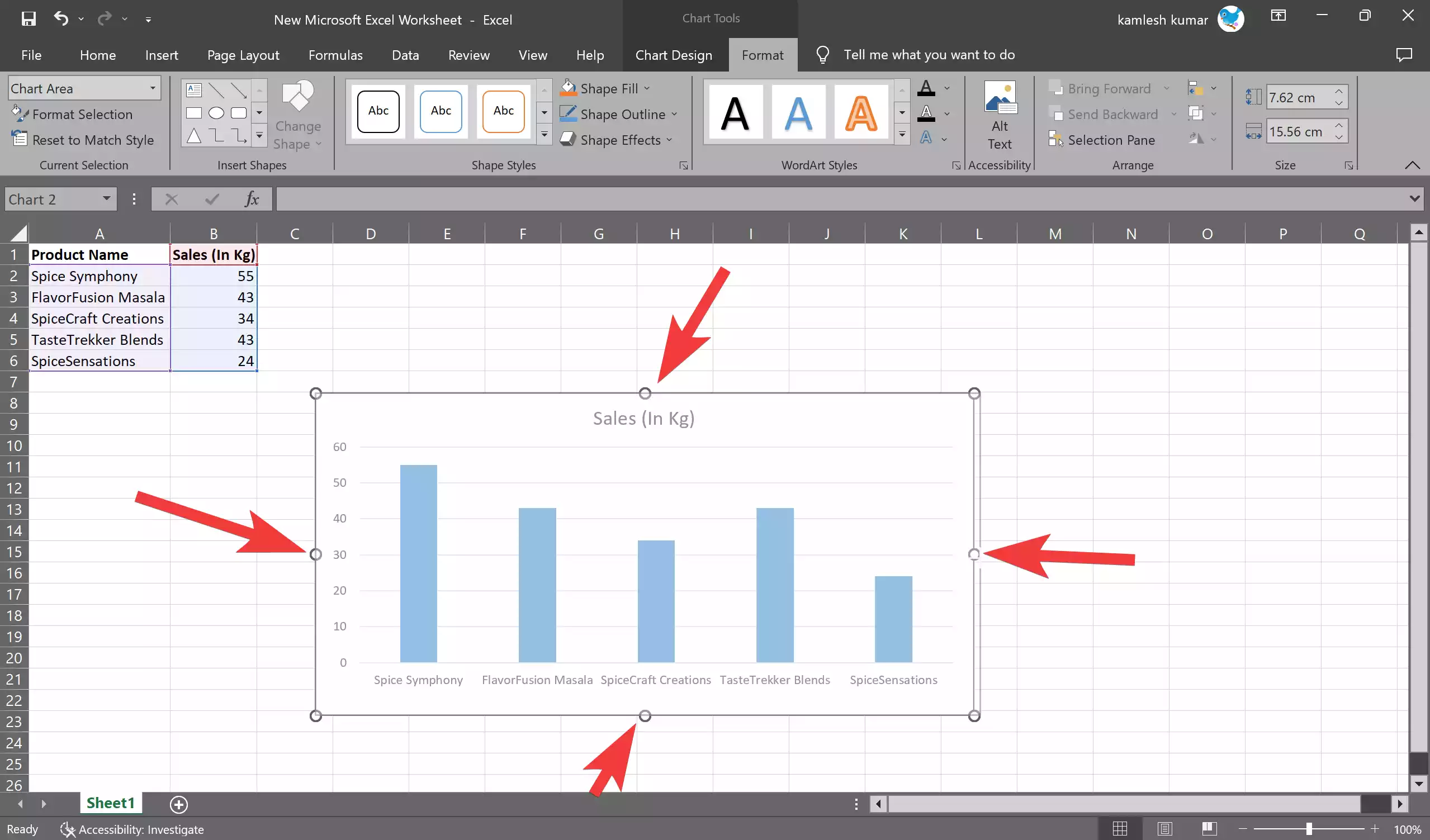
Step 9. You can move the chart to a different location on the sheet by clicking and dragging it. To resize the chart, click on its edges and drag to the desired size.
Step 10. After you’ve created and customized your chart, save your Excel file. You can also copy and paste the chart into other documents, or export it as an image or PDF to share with others.
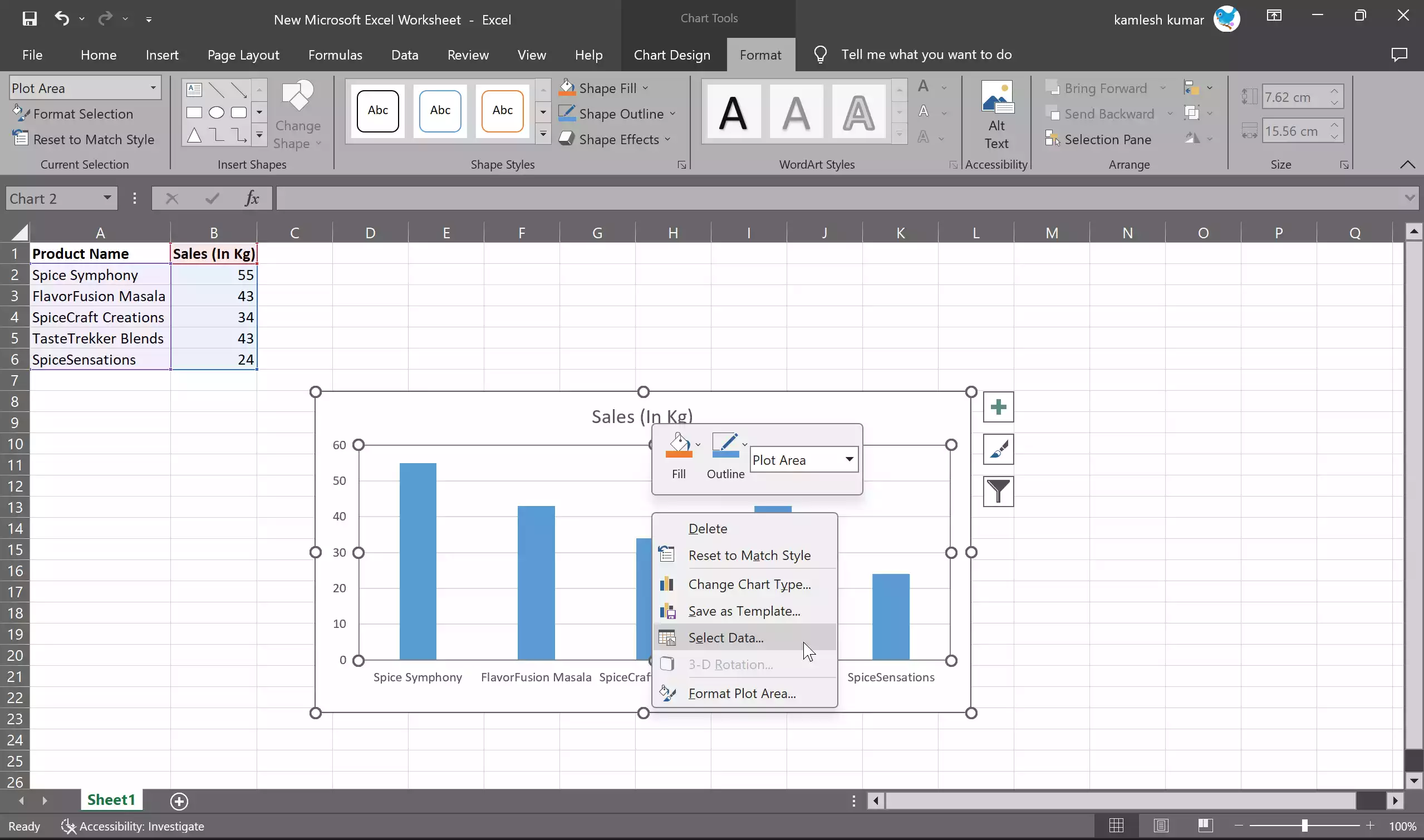
Step 11. If your data changes, you can easily update your chart. Just right-click on the chart and select “Select Data” to modify the data source.
Conclusion
Creating charts and graphs in Excel is a valuable skill for anyone working with data. Whether you’re a business analyst, a student, or a researcher, Excel’s charting capabilities allow you to present your information in a visually compelling way. Follow this step-by-step guide, and you’ll be well on your way to creating informative and professional-looking charts and graphs in Excel.