Line charts, area charts, bar graphs, and pie charts are among the charts available in Microsoft Word. Pie charts are the most popular types of charts that display data, information, and statistics in a circular way. They are also called pie graphs, circle graphs, and circle charts.
You can create a variety of charts with Word’s Chart tool, including Pie charts. Default charts come with a connected worksheet, ready for you to insert or copy the data that creates the chart’s layout. You can edit the chart’s style, color, and format once you’ve added data.
A Pie chart is used to compare statistical data and is usually drawn with a circle divided into segments. The segments represent the contributions of each category. Additionally, Pie charts are ideal when there is only one data set to compare. Using a Pie chart is also a good way to show categorical data within a business, such as profits, exposure, and so forth.
This gearupwindows article will explain how to create a pie chart in Microsoft Word.
How to Create a Pie Chart in Microsoft Word?
Use these steps to create a pie chart in Microsoft Word:-
Step 1. Navigate to the location where you want to insert the pie chart in a Word document.
Step 2. To change the ribbon, click on the Insert tab in the main menu.
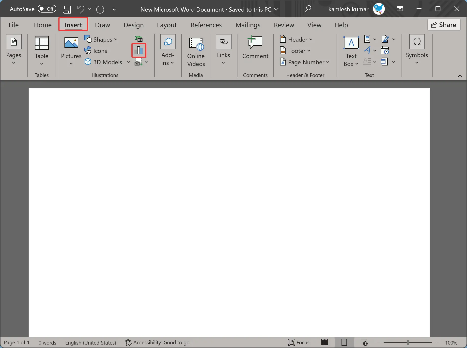
Step 3. In the Illustrations section, click on the Chart icon.
Step 4. When you’re done, the Insert Chart dialog box will open.
Step 5. Select Pie in the left sidebar. Then, you’ll find five types of Pie charts:-
- Pie
- 3D Pie
- Pie of Pie
- Bar of Pie
- Doughnut
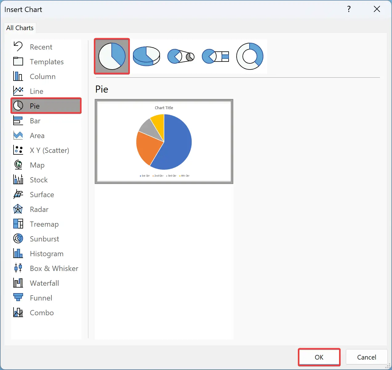
Step 5. Click on any you want to use. For example, we have selected Pie.
Step 6. Next, click on the OK button, and the Pie chart with its default data will appear in the document.
How to Customize a Pie Chart in Word?
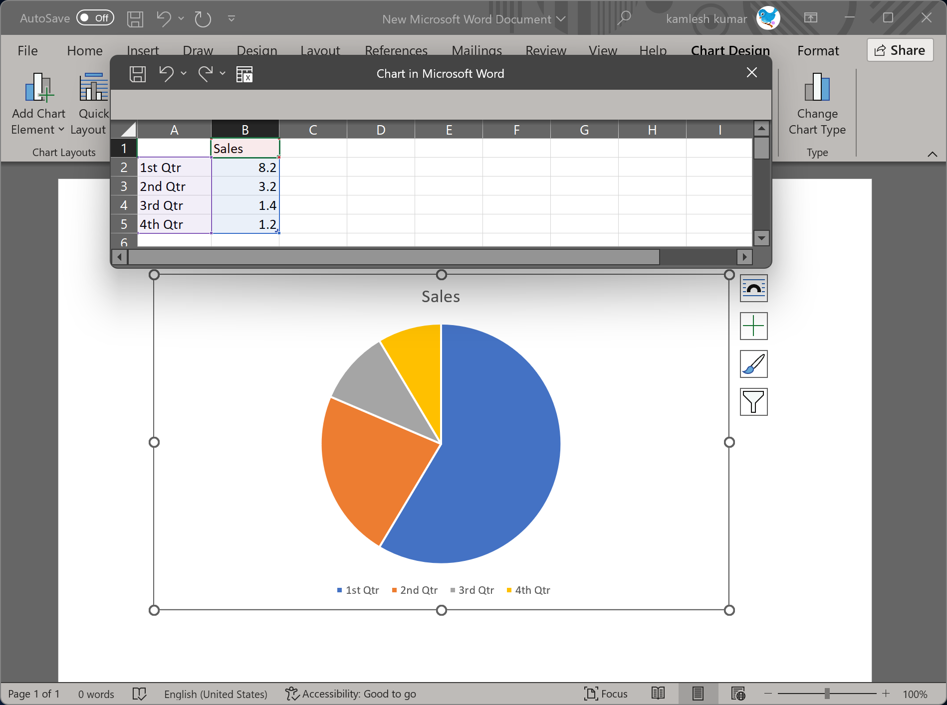
Pie charts created in Word documents are useless unless they are filled out with valid data. Follow these steps to customize and fill data in a Pie Chart in Word:-
Step 1. Click inside the Excel worksheet and enter the data according to your requirements.
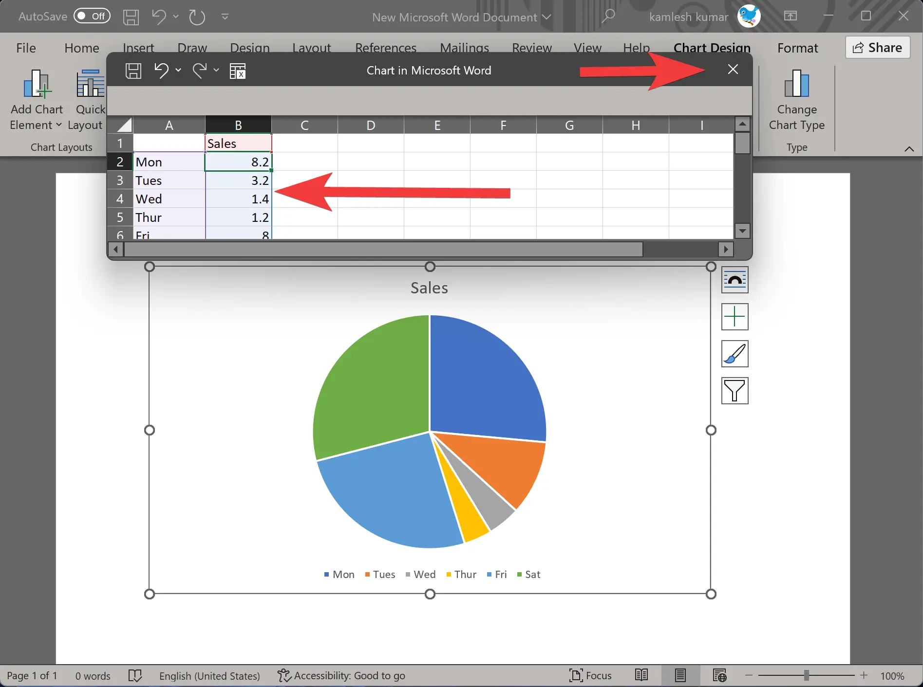
Step 2. When you are done, click the X icon in the top right corner to close the Worksheet.
Your changes will be automatically reflected in the Pie chart.
How to Change Chart Style in Word?
If the default pie chart does not meet your requirements, click the Pie chart to select it. You will now see some icons on the right side. The following are among them:-
- Layout Options
- Chart Elements
- Chart Styles
- Chart Filters
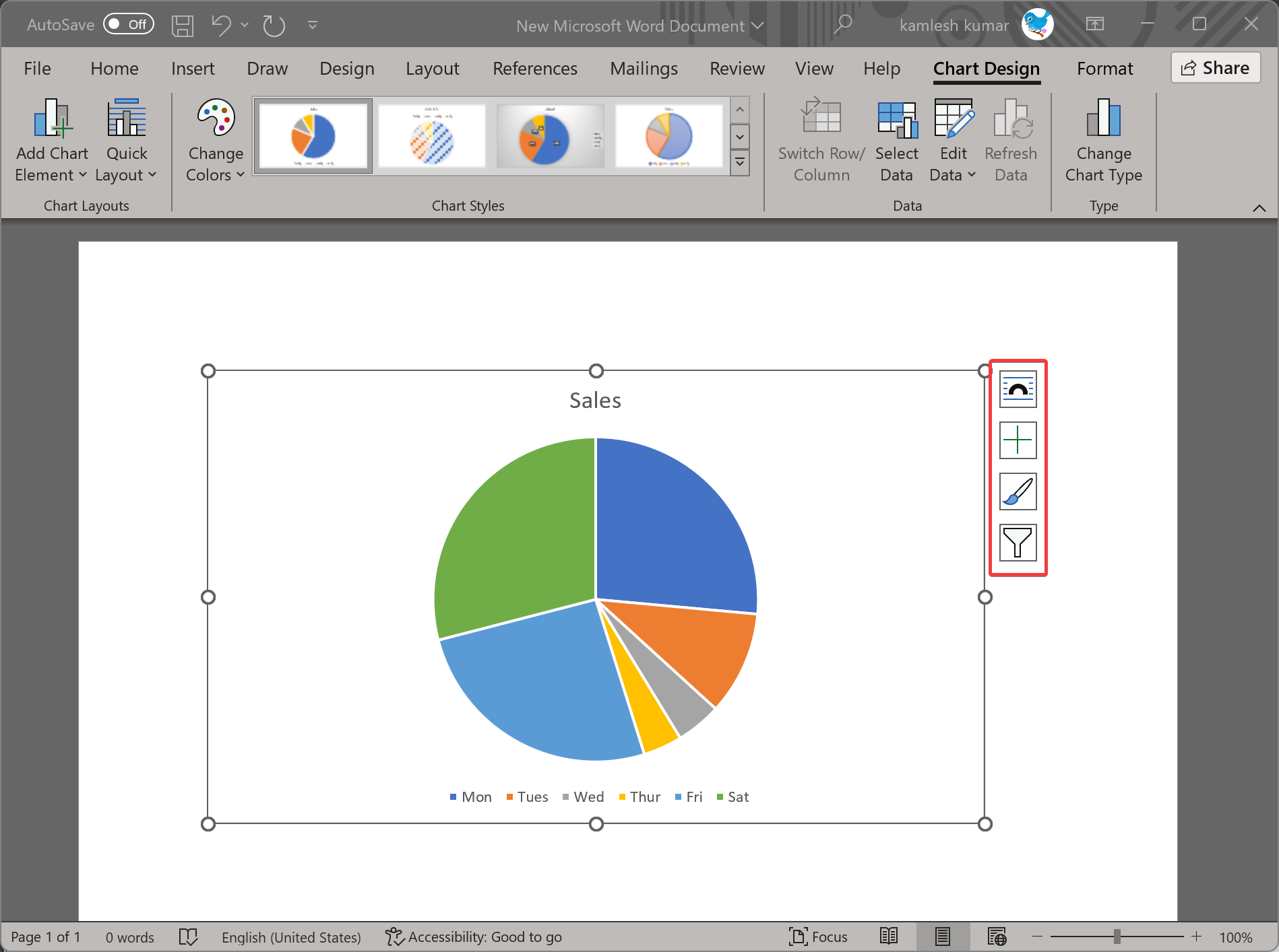
If you want to customize your chart further and give it a unique look, you can use the above options.
Conclusion
In conclusion, Microsoft Word provides a variety of chart types that users can create and customize to display data effectively. Pie charts, in particular, are widely used for displaying data in a circular format. This article has provided step-by-step instructions for creating a pie chart in Word and customizing it according to your needs. With the ability to change chart style, format, and layout, users can create visually appealing charts that effectively communicate their data. Whether you are a business owner or a student, using pie charts in Microsoft Word can make your data presentations more effective and engaging.
