Microsoft Excel is a powerful tool for data visualization, and one of its most commonly used features is creating charts and graphs. Charts are an excellent way to present data in a visually appealing and easy-to-understand manner. When you create a chart in Excel, you often want to include data labels to provide context and clarity to the information presented. Data labels show specific data points on the chart, such as the values of bars in a bar chart or the percentages in a pie chart. In this article, we will explore how to add and customize data labels in Microsoft Excel charts.
How to Add and Customize Data Labels in Microsoft Excel Charts?
Adding Data Labels to a Chart
Before you can customize data labels, you need to add them to your chart. Here’s how to do it:-
Step 1. Create Your Chart: Start by selecting the data you want to chart, then go to the “Insert” tab on the Excel ribbon. Choose the chart type that best suits your data, such as a column chart, bar chart, pie chart, or any other available chart type.
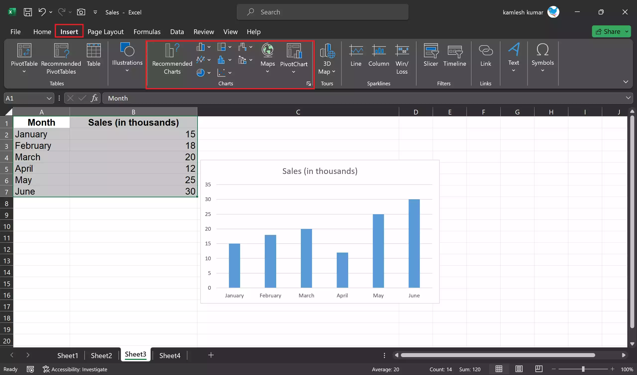
Step 2. Select the Chart: Click on the chart to select it. You should see the “Chart Elements” button (a plus sign icon) appear in the upper-right corner of the chart.
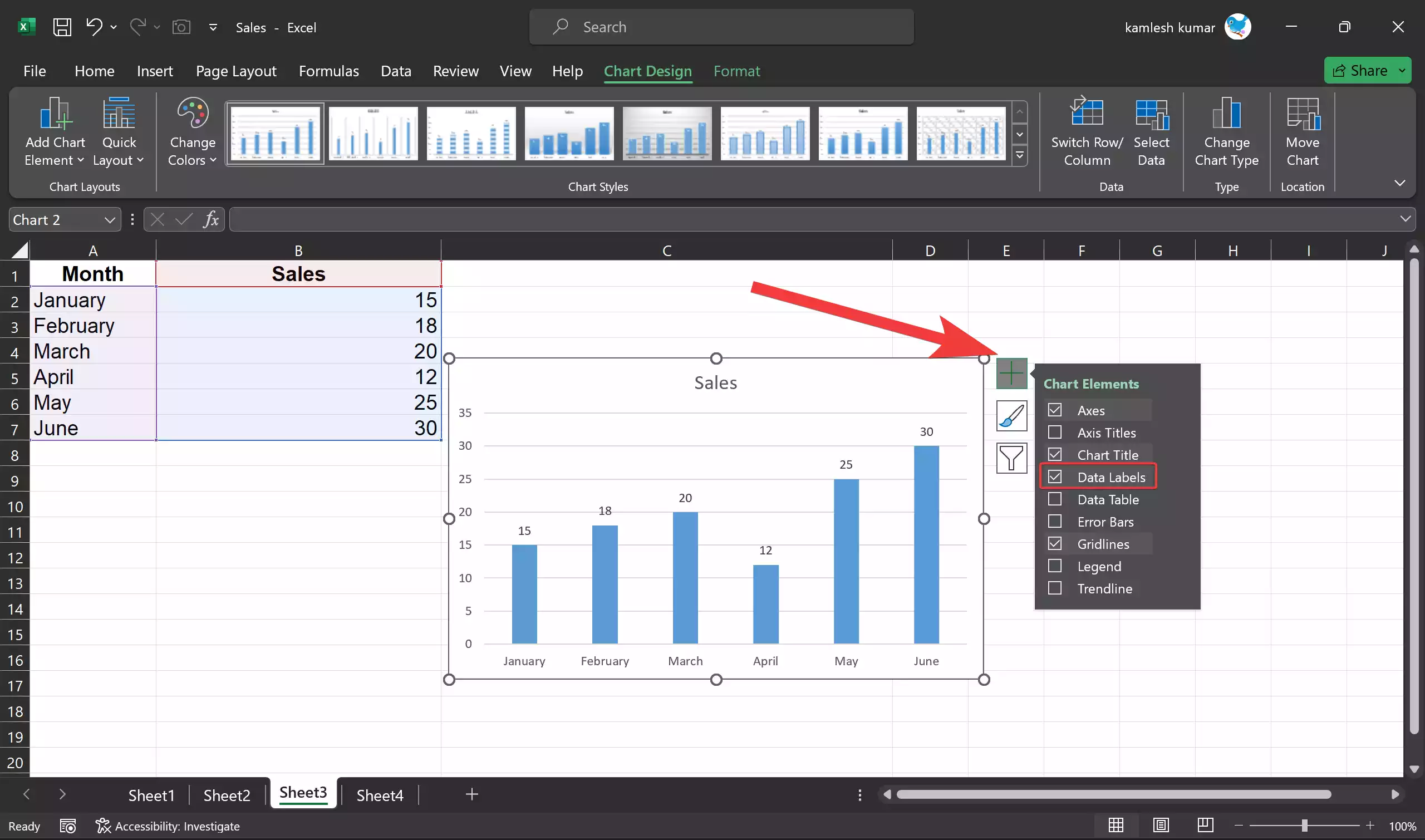
Step 3. Add Data Labels: Click the “Chart Elements” button, and a dropdown menu will appear. Check the “Data Labels” option, and data labels will be added to your chart.
The default data labels will typically display the values of the data points on the chart. However, you can further customize them to meet your specific needs.
Customizing Data Labels in Excel Charts
Excel offers a variety of options for customizing data labels in your charts. These options allow you to make your data labels more informative and visually appealing. To customize data labels, follow these steps:-
Step 1. Select the Data Labels: Click on the data labels in your chart. You can either click on an individual data label to select it or select all data labels by clicking anywhere on the chart, and then click on the data labels you want to customize.
Step 2. Format Data Labels: Once you have selected the data labels, right-click on them and choose “Format Data Labels” from the context menu. Alternatively, you can access the formatting options from the “Format” tab in the Chart Tools section of the Excel ribbon.
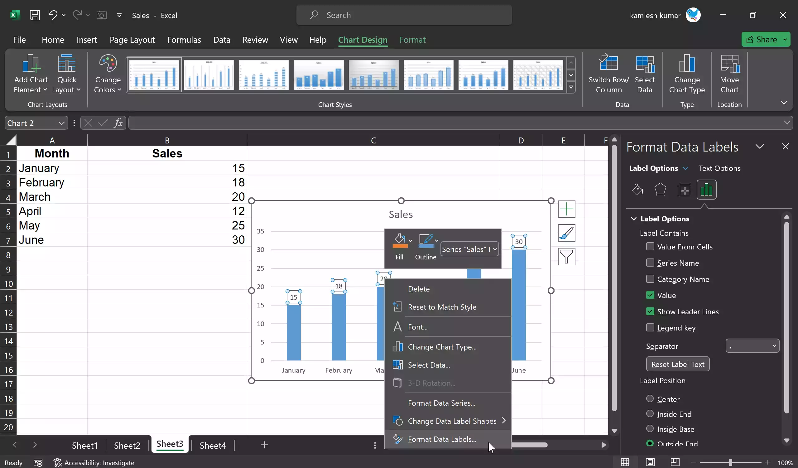
Step 3. Customization Options: A formatting pane will appear on the right side of the Excel window. Here, you can customize various aspects of the data labels, including:-
- Label Options: You can choose whether to display values, percentages, or other label options specific to the chart type.
- Label Position: You can choose where the data labels are positioned, such as above the data points, below them, or inside them.
- Label Fill and Border: You can change the background color of the data labels, add borders, or modify the font properties.
- Number Format: If you’re displaying values, you can specify how those values should be formatted, including the number of decimal places.
- Text Options: Customize the appearance of the text within the data labels, including font size, color, and style.
Step 4. Apply Customizations: After you’ve adjusted the data label settings to your liking, click “Close” to apply the changes. Your chart will now display the data labels with your customized formatting.
Removing Data Labels
If you decide you no longer want data labels on your chart, it’s easy to remove them:-
Step 1. Select the chart.
Step 2. Click the “Chart Elements” button on the upper-right corner of the chart.
Step 3. Uncheck the “Data Labels” option in the dropdown menu.
The data labels will be removed from your chart.
Conclusion
Adding and customizing data labels in Microsoft Excel charts is a valuable skill for anyone who works with data visualization. Data labels enhance the readability and understanding of your charts by providing context and precise information about the data points. By following the steps outlined in this article, you can create and format data labels to make your charts more informative and visually appealing. Excel’s flexibility in customizing data labels allows you to tailor your charts to meet specific presentation and reporting needs, ensuring that your data is effectively communicated to your audience.
