Throughout the years, Word has provided us with an endless amount of options for creating virtually any document we like. In fact, it has a lot of capabilities that are perhaps less known, such as creating a creative timeline.
With this program, we can also create and edit documents from our mobile phones, which is very useful if we do not have access to a PC.
Microsoft Word is very useful for creating and editing documents, as well as creating concept maps, graphs, and histograms. It is easier to understand digital data when it is presented in an orderly and understandable manner with a histogram.
Typically, Microsoft Excel is used to create charts of this type, but sometimes you might need or want to use Microsoft Word in place. The vertical bars of this chart are proportionate to display the data details clearly.
Unlike a standard bar chart, a histogram groups the numbers into ranges without leaving any spaces between the bars.
This gearupwindows article explains how to create a Histogram chart in Microsoft Word.
How to Make a Histogram Chart in Microsoft Word?
Make a Histogram Chart in Microsoft Word by following these steps:-
Step 1. First, open your existing or a new Microsoft Word document.
Step 2. Next, place the cursor on Word where you want to insert the Histogram Chart.
Step 3. Select the Insert tab on the menu bar and then click the Add a Chart button under the Illustrations group.
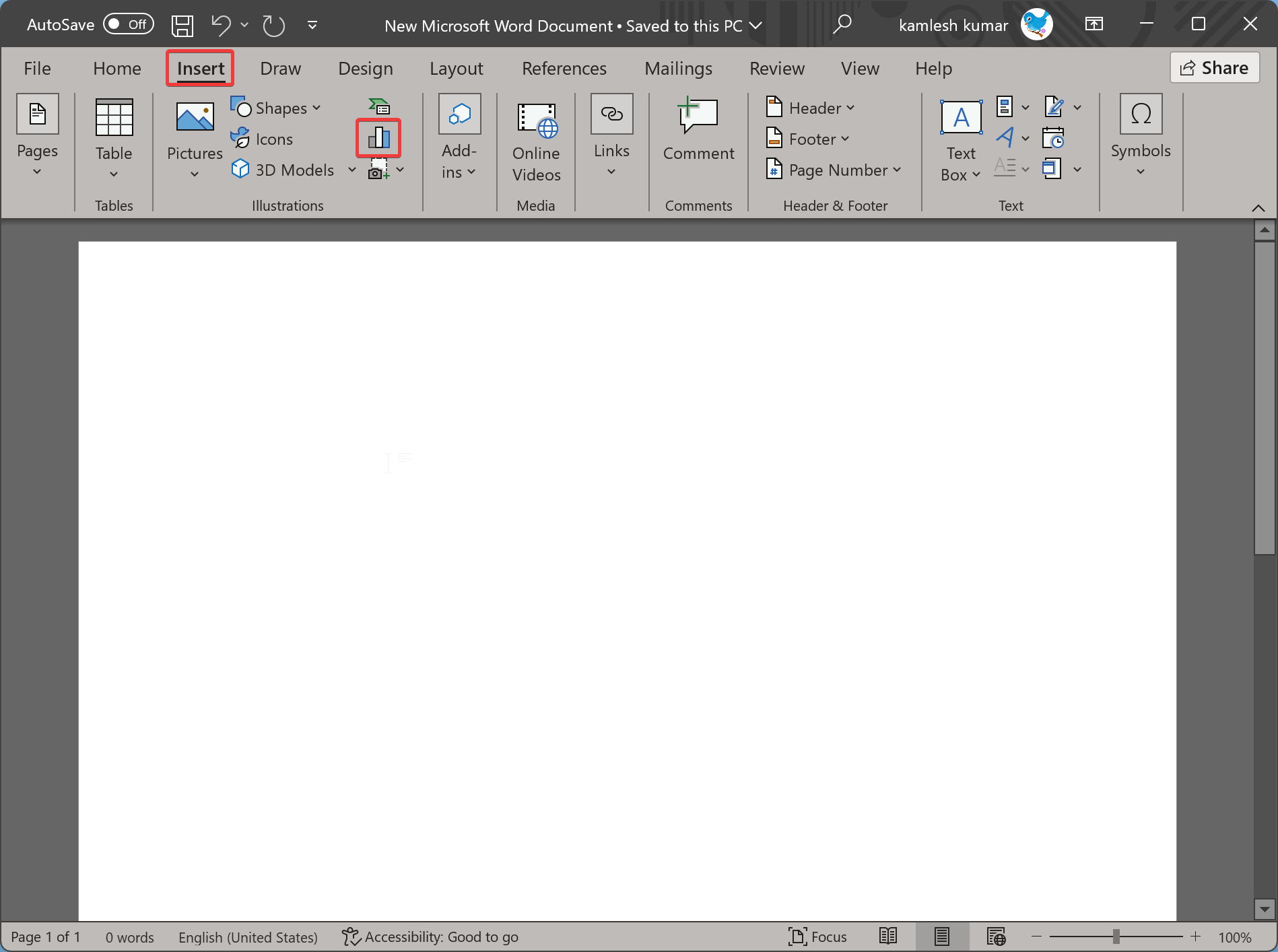
Step 4. When you’re done, the Insert Chart dialog will appear on your computer.
Step 5. In the Insert Chart dialog box, click the Histogram on the left pane.
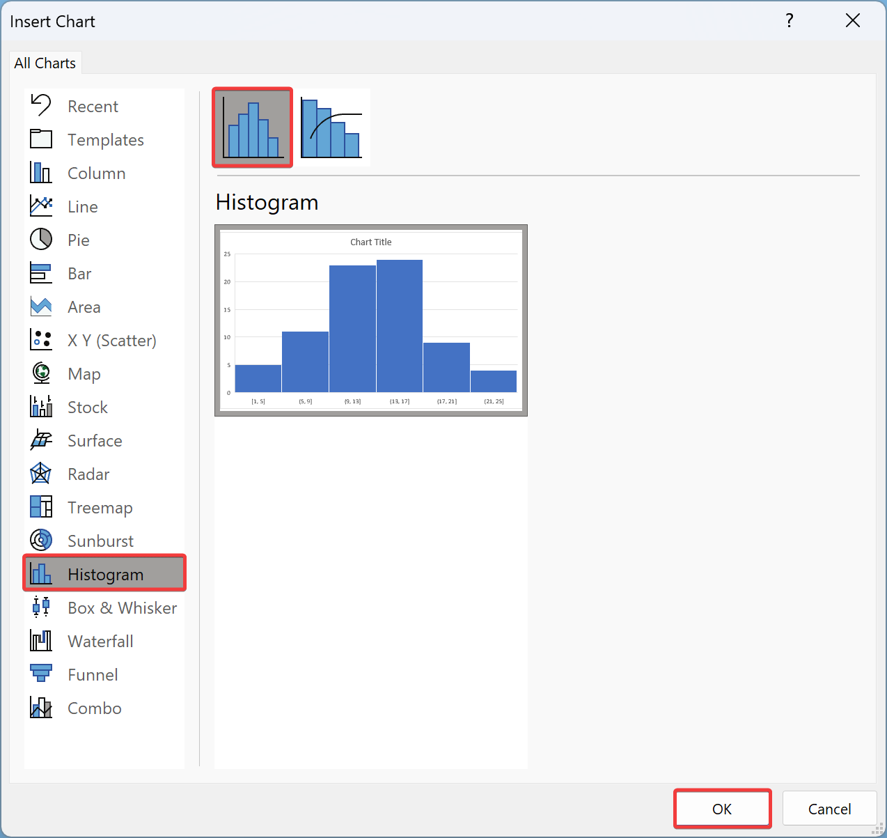
Step 6. Once done, on the right sidebar, you will find two types of charts. These include:-
- Histogram
- Pareto
Select a chart according to your requirements. For instance, we have chosen Histogram.
Step 7. Now, click the OK button to insert the chart into your Word document.
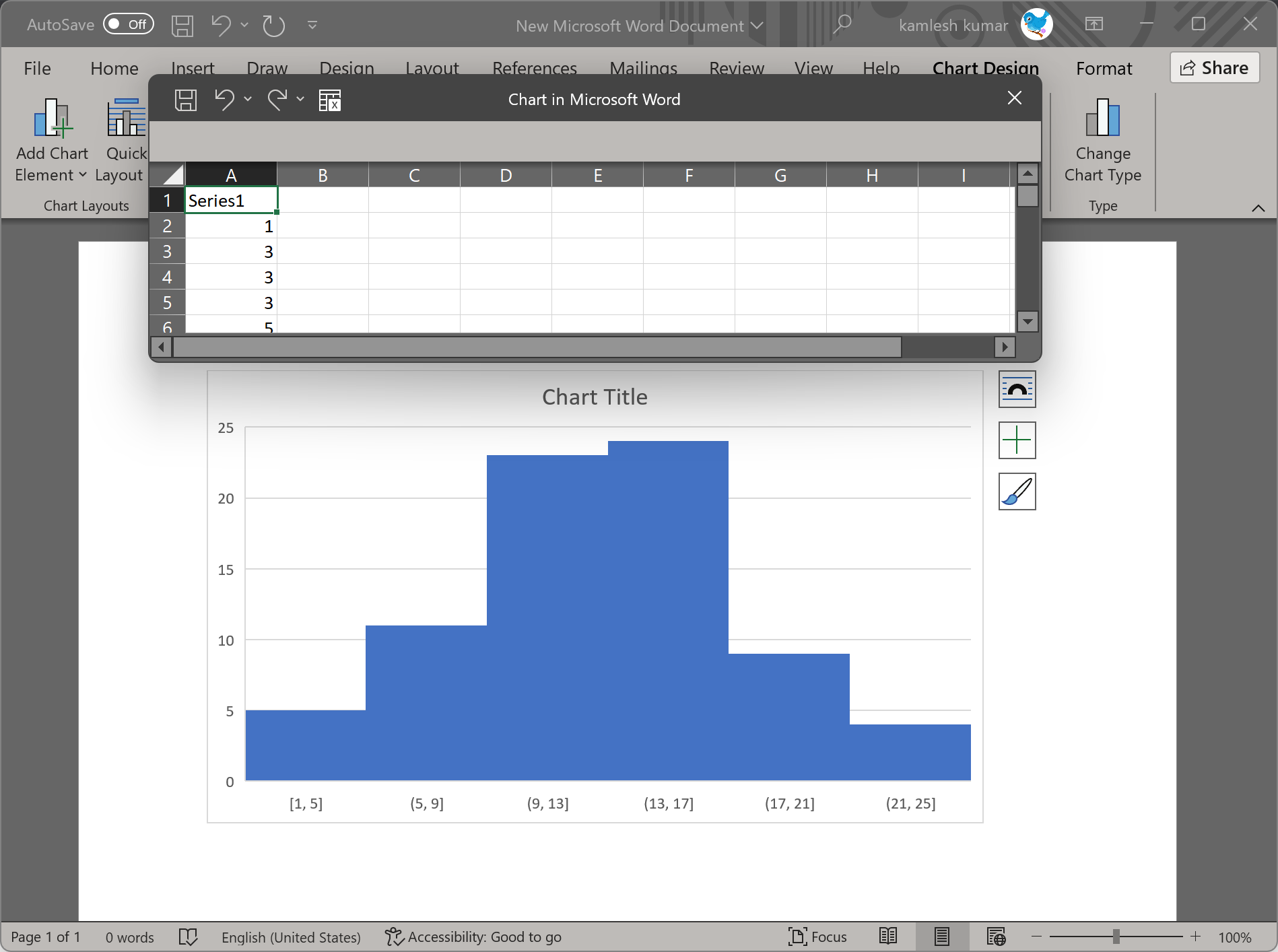
Once you execute the above steps, you will find a Histogram chart in your Word document. An Excel spreadsheet will also appear on top of your Word program with default values.
How to Edit Histogram Chart in Word?
Once you have a chart on the Word document, you can edit this histogram chart by following these steps:-
Step 1. Select the chart by clicking it.
Step 2. Fill Excel spreadsheet with the data you want in your chart.
Step 3. Close the spreadsheet by clicking the x icon.
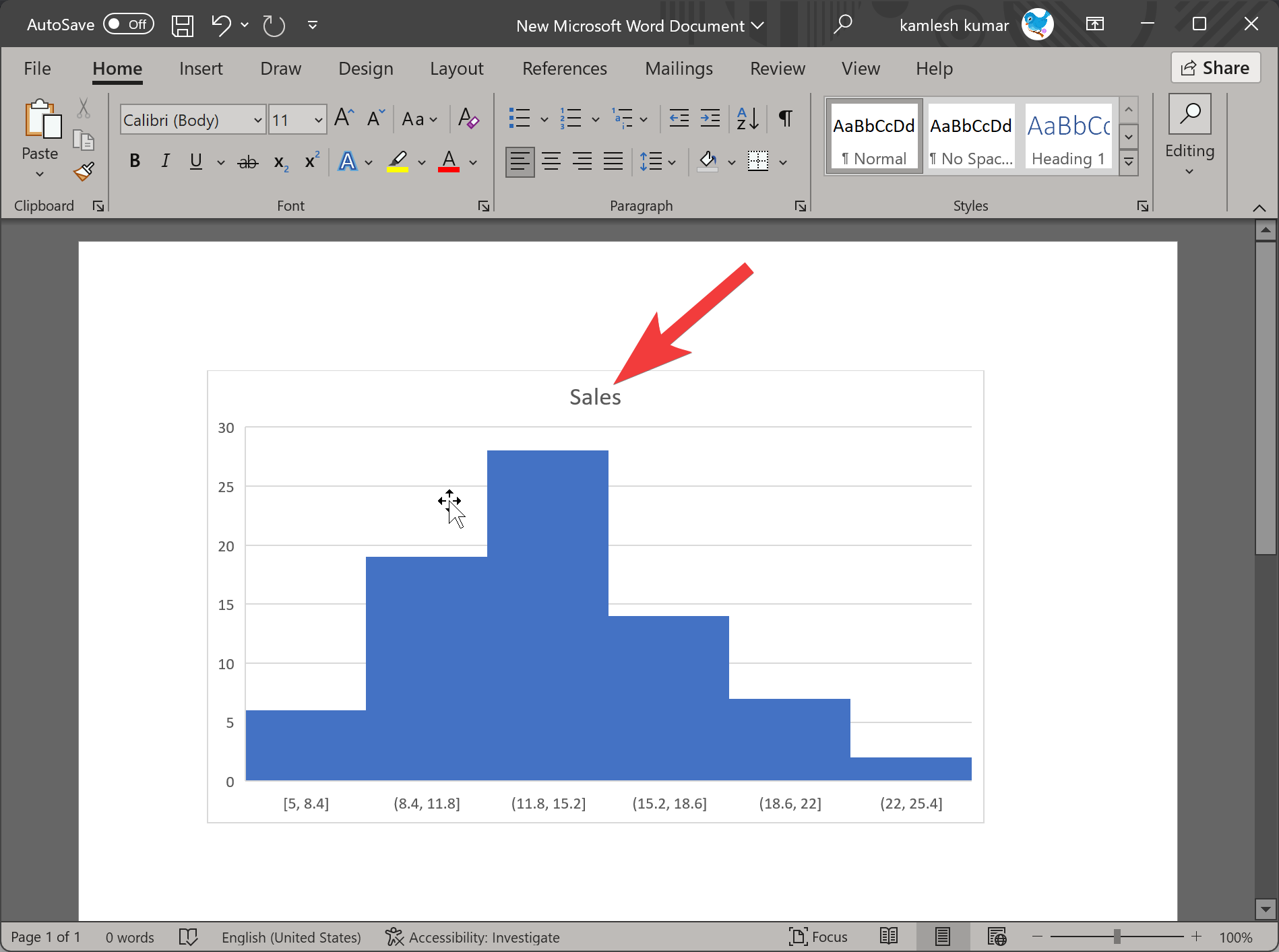
Step 4. If you want to change the title of the chart, double-click on the Chart Title and enter the desired text you want.
Step 5. Once you have finalized the chart and later you want to edit its values, select the chart by clicking on it.
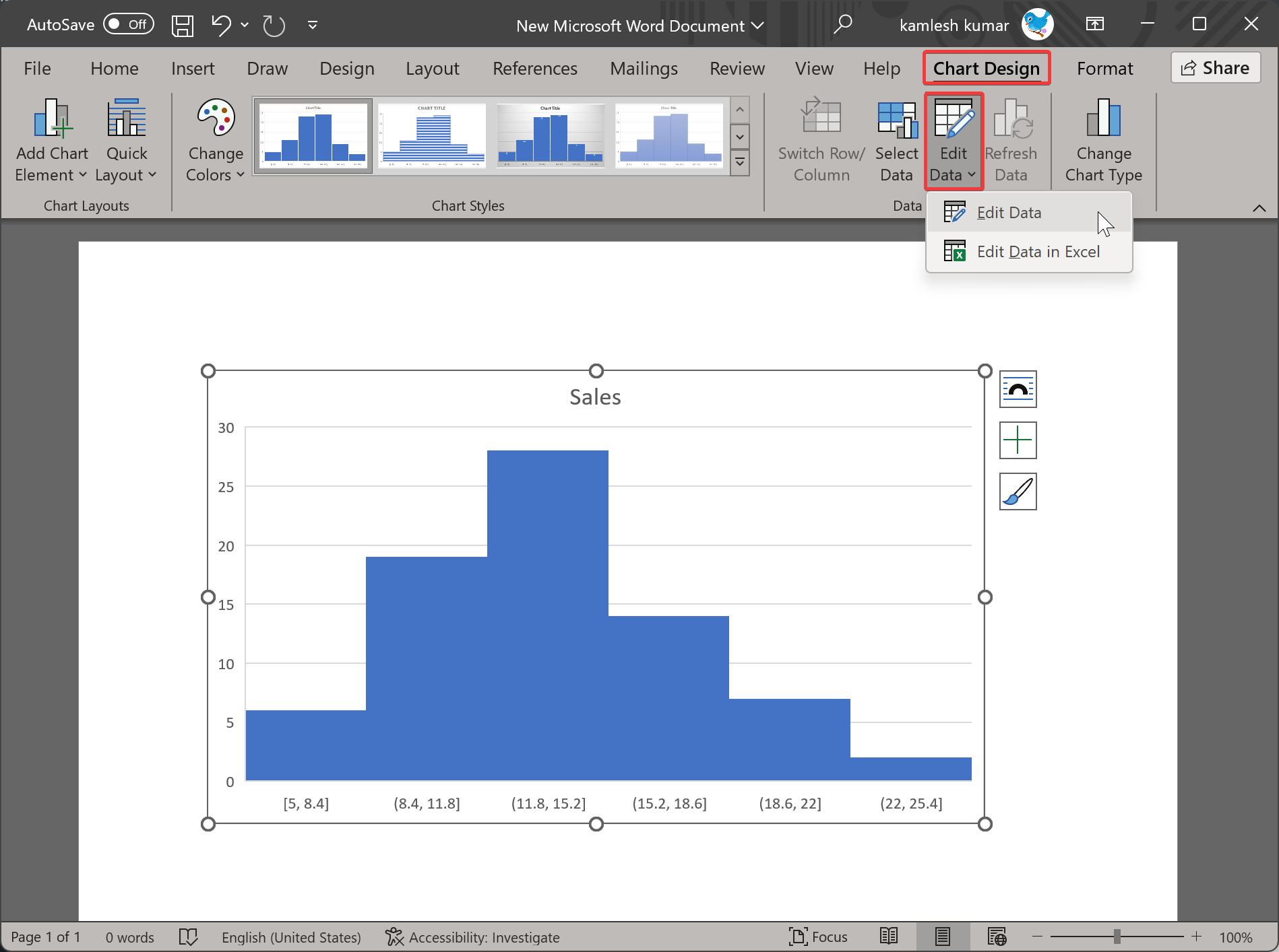
Step 6. Click on the Chart Design tab in the menu bar and select Edit Data > Edit Data. Now, Excel Spreadsheet will appear which data you can edit again.
How to Change Histogram Chart Style in Word?
If the default Histogram chart does not meet your requirements, click on it to select it. You will now see some icons on the right side. The following are among them:-
- Layout Options
- Chart Elements
- Chart Styles
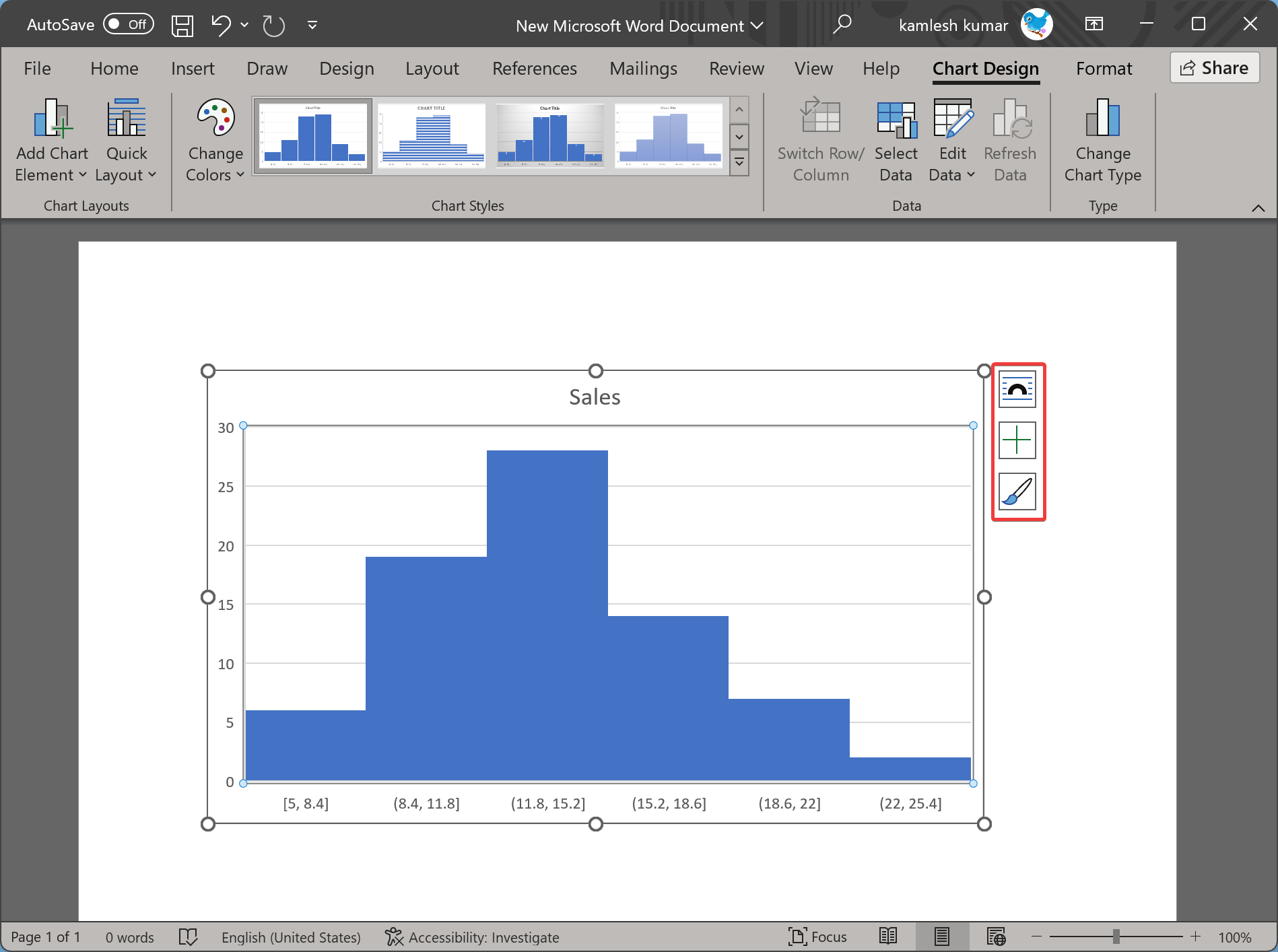
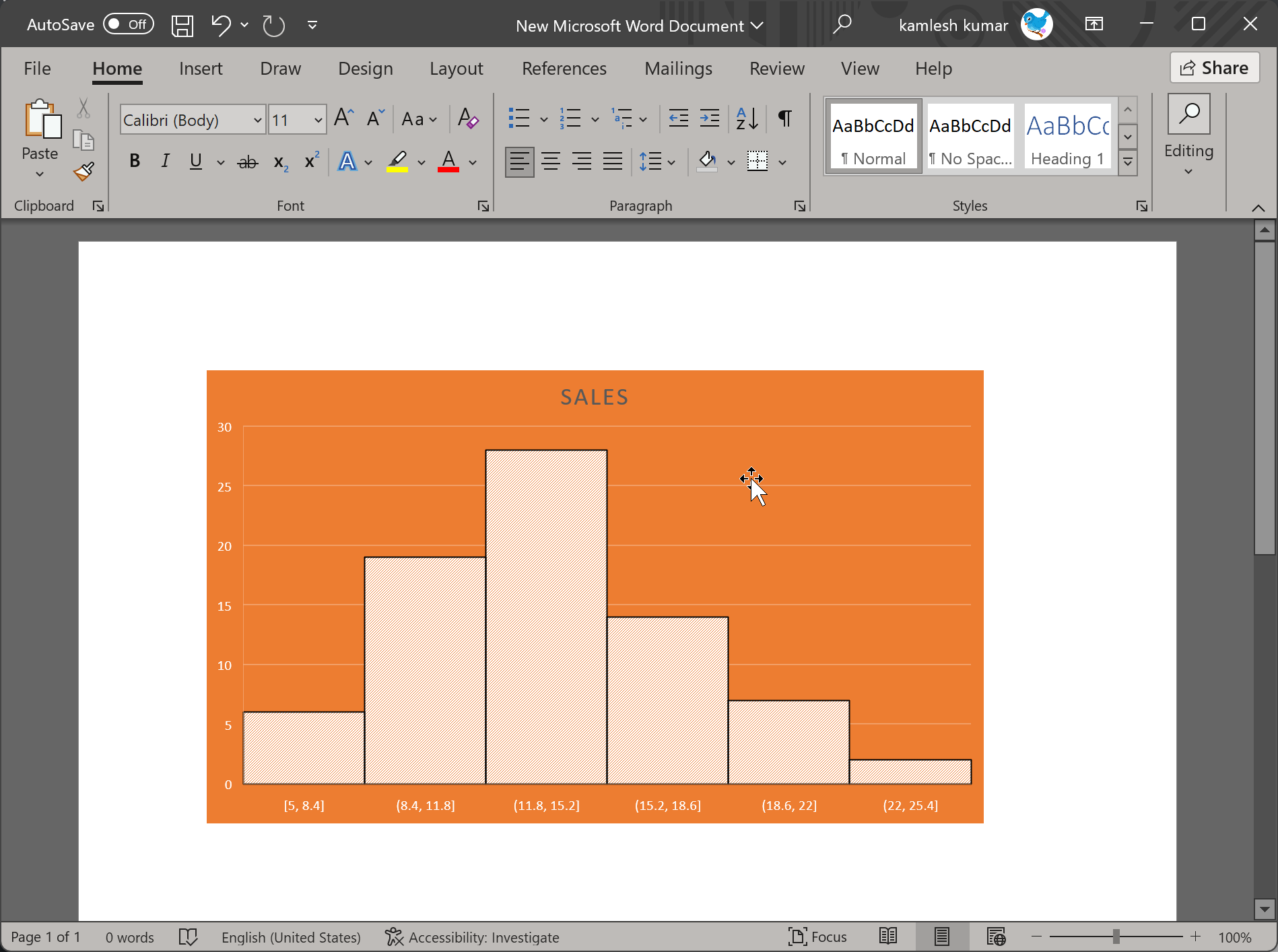
Using these options, you can customize your chart further and give it a unique look.
Conclusion
In conclusion, Microsoft Word is a powerful tool for creating and editing documents, and its capabilities extend beyond just text. One such capability is the creation of a histogram chart, which can be helpful in presenting data in a clear and organized manner. With the simple steps outlined in this article, anyone can create and edit a histogram chart in Microsoft Word, allowing for more effective communication and presentation of data. Additionally, the ability to customize the style of the chart allows for a unique and personalized touch. Overall, Microsoft Word continues to be an essential tool for both personal and professional use.
